Well, this is VERY fun for me. When I threw out a poll on Instagram asking which “reveal” I should do next, I was so surprised to see that you all wanted to see + know more about our house more than any others (don’t worry: Carriage Hills reveal is still coming).
First, some history. This is our second home as a family. We purchased our first home in 2009 and lived there for almost 8 years, slowly renovating it over time. After Deacon (our third boy) was born, we realized that while we loved our home, our time as a family there was probably done. So on Christmas Eve 2016, we made an offer on our current home (just two miles up the road). We low-balled, they countered, we countered…then nothing. No movement. The house had been on the market for months, but for some reason the sellers were very firm in their pricing. We were sad to walk away, but we knew that getting into the right house for the wrong price and overextending ourselves lacked all the wisdom. So, we thanked them for their time and put the dream to bed.
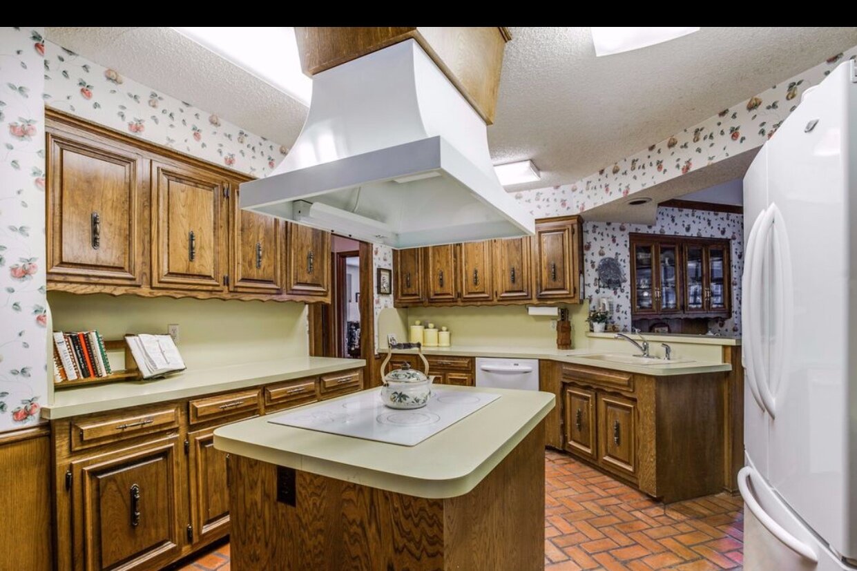
BEFORE
We got through Christmas and the week after, and neither Fultz nor I could stop thinking about this house. It just had everything we were looking for: tons of light (or at least opportunity for it with the right updates), high ceilings, incredible playroom space (we were still reeling from Christmas and all. the. toys.), sweet neighborhood, and (best of all) it hadn’t been updated in probably 30 years (I wanted a blank slate so we could make this home our own). I guess I wanted to wallow a bit, because on a whim I brought up the listing on my computer (just to look at it? no clue) and realized that it had been taken off the market the day before. I texted our realtor to see if he could do a little digging and/or nudging (“Tell them we’re still SUPER interested if they still want to sell!”). I still don’t know what changed for the seller (maybe they were tired of my persistence? quite possible), but low and behold, they were ready to sell for our last offered price.
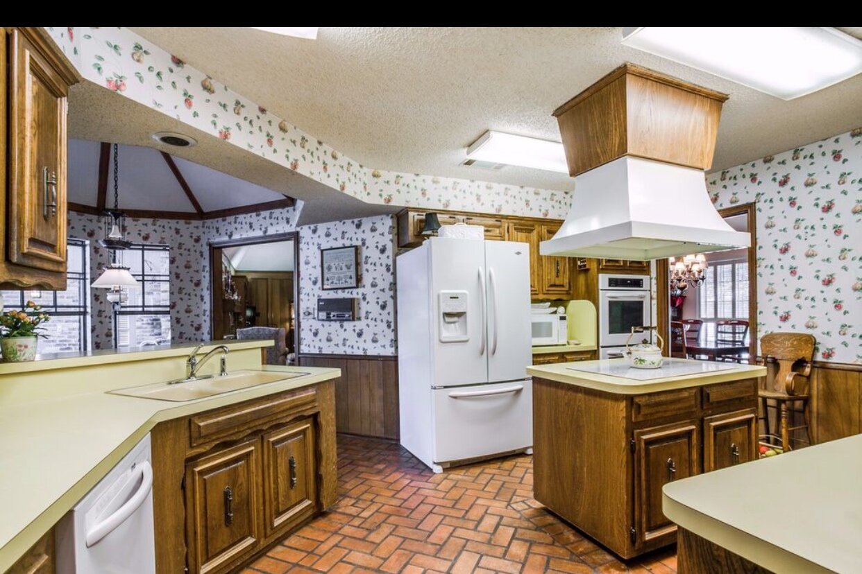
BEFORE
Things kicked into high gear at that point as we made our home at the time ready to list, sold it (one day I’ll tell you the story about how one of the boys shat all over his room 20 minutes before our inspection – actually that’s it. that’s the story). Then we found our contractor, finalized design plans, moved into a 900 sqft duplex during construction, got two of our siblings married off, and finished the school year. It was a cuh-RAZY time, but also a sweet one.
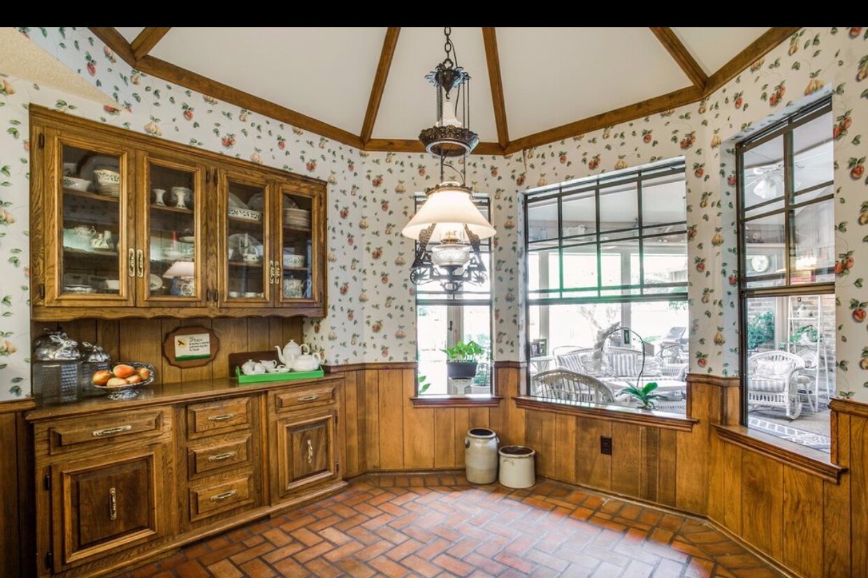
BEFORE
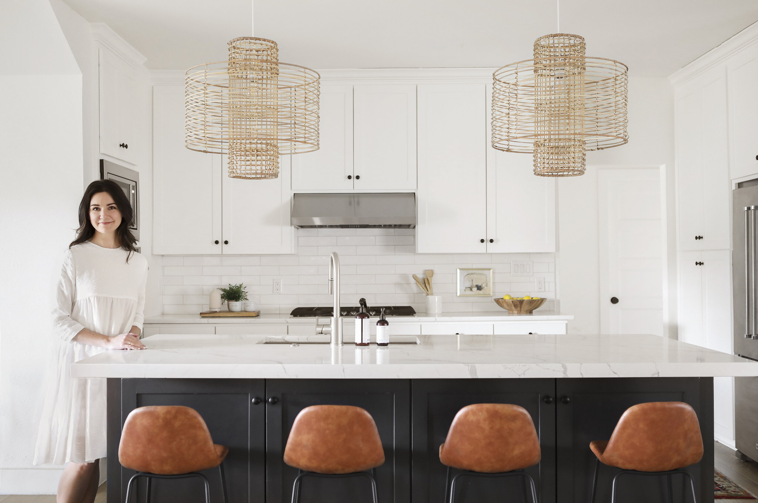
So that’s our little love story with this home. Aside from the boys’ bathroom (which we came back to a year later), we were able to finish all renovations before we moved in which was amazing. The kitchen was probably the biggest undertaking, so I figured we’d start our tour there (all photos by Matti Gresham)…
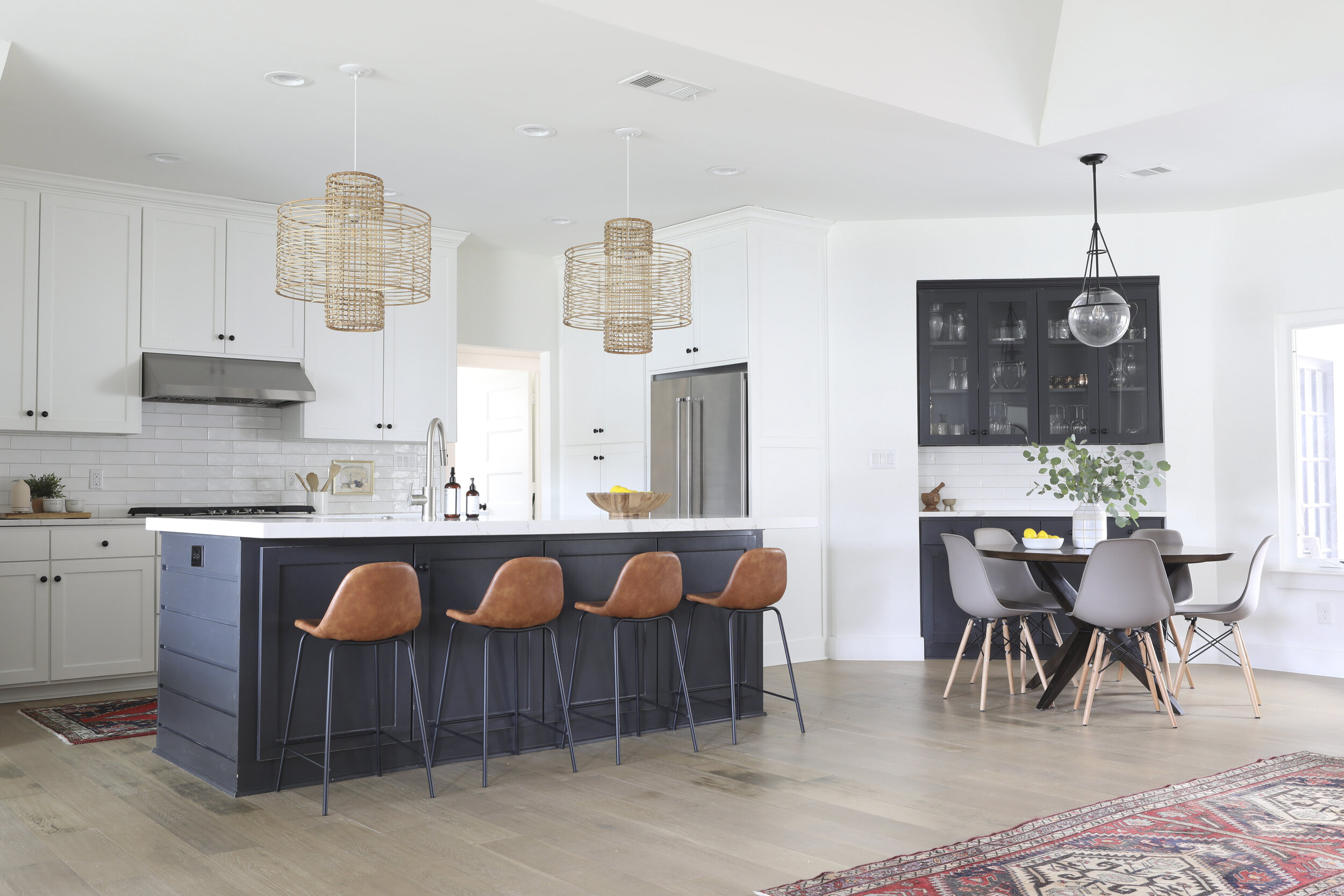
Island Pendants // Nook Pendant (out of stock, but similar here) // Counter Stools (out of stock, but similar and better here // Dining Table // Dining Chairs // Runners (vintage, but similar here)
Structurally, there is a lot happening here. We removed the walls separating the kitchen from the family room and dining room (our last house was very closed off, so we were really embracing the open concept idea here). Removing the walls also left us with the predicament of managing four different ceiling heights (dining, kitchen, breakfast nook, and family room). We decided to raise the kitchen ceiling to match the dining room (9 feet), and ran a steel beam through the attic across and into the breakfast nook, matching that ceiling to the kitchen to create one cohesive space.
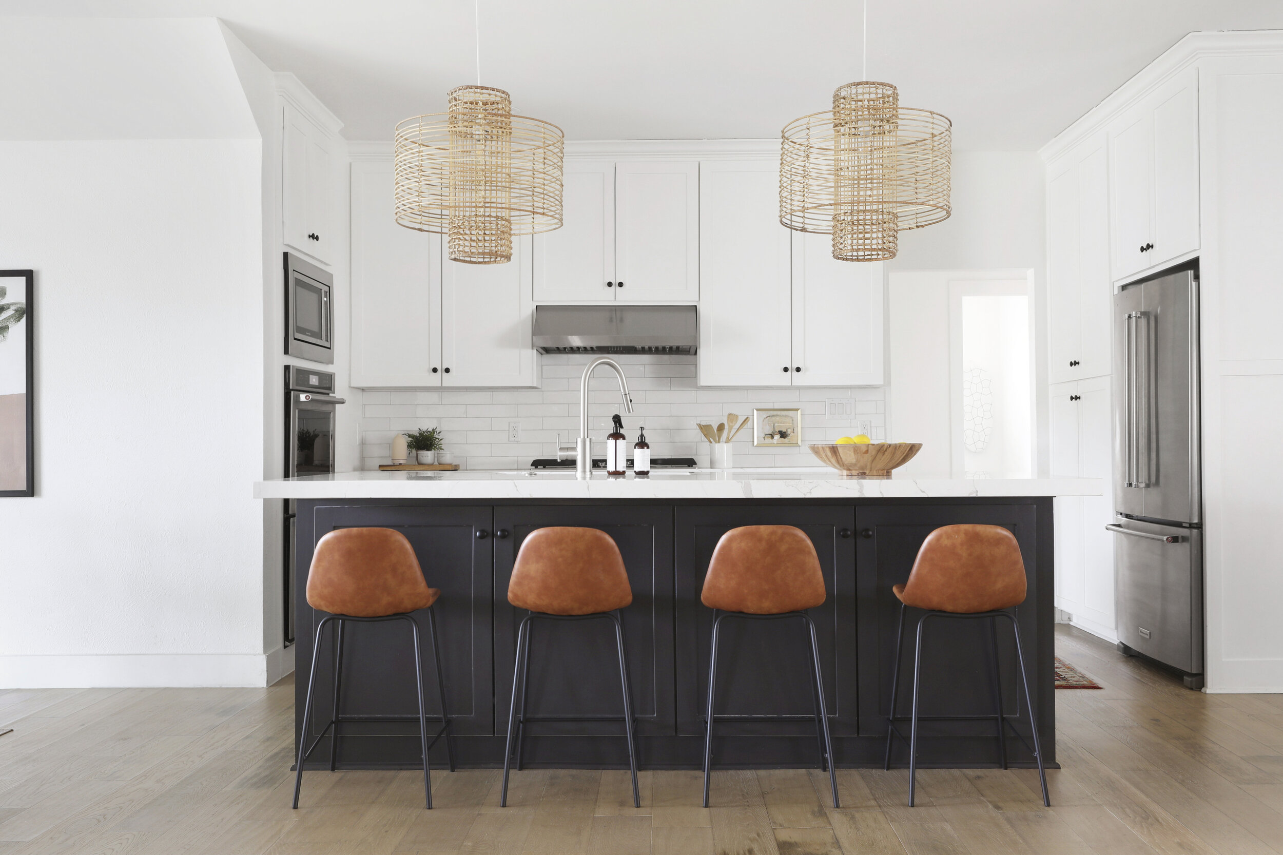
Our island is on the larger side (about nine feet long), so finding a countertop slab that would fit the space without a seam was important to me. We went with the Calacatta Laza quartz from MSI, and we couldn’t be happier. I love how the veining is large and sweeping, as opposed to smaller swirls (looks more like marble, in my opinion).
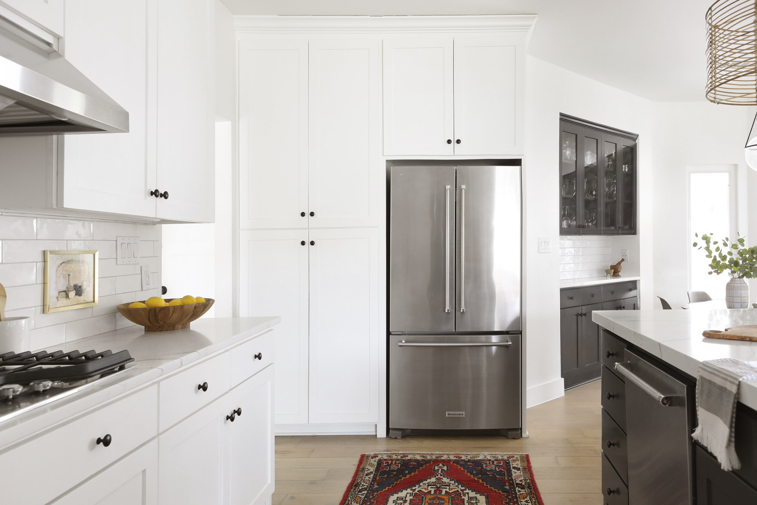
Refrigerator // Dishwasher // Cooktop // Runner (vintage, but similar here) // Backsplash Tile // Hand Towel // Wood Bowl (similar) // Cabinet Hardware
With three little boys (and a general dislike of fastidiousness in the kitchen), the durability of quartz was a major appeal – it’s a manmade product and basically indestructible. In the image above you can see how it looks as though the island slab is thicker than the perimeter, but in reality, they are the same (3cm). We just had the island fabricated to have a bookmatched mitered edge (think of the way a shoe box lid fits over the box) on the island, giving it that beefier appearance.
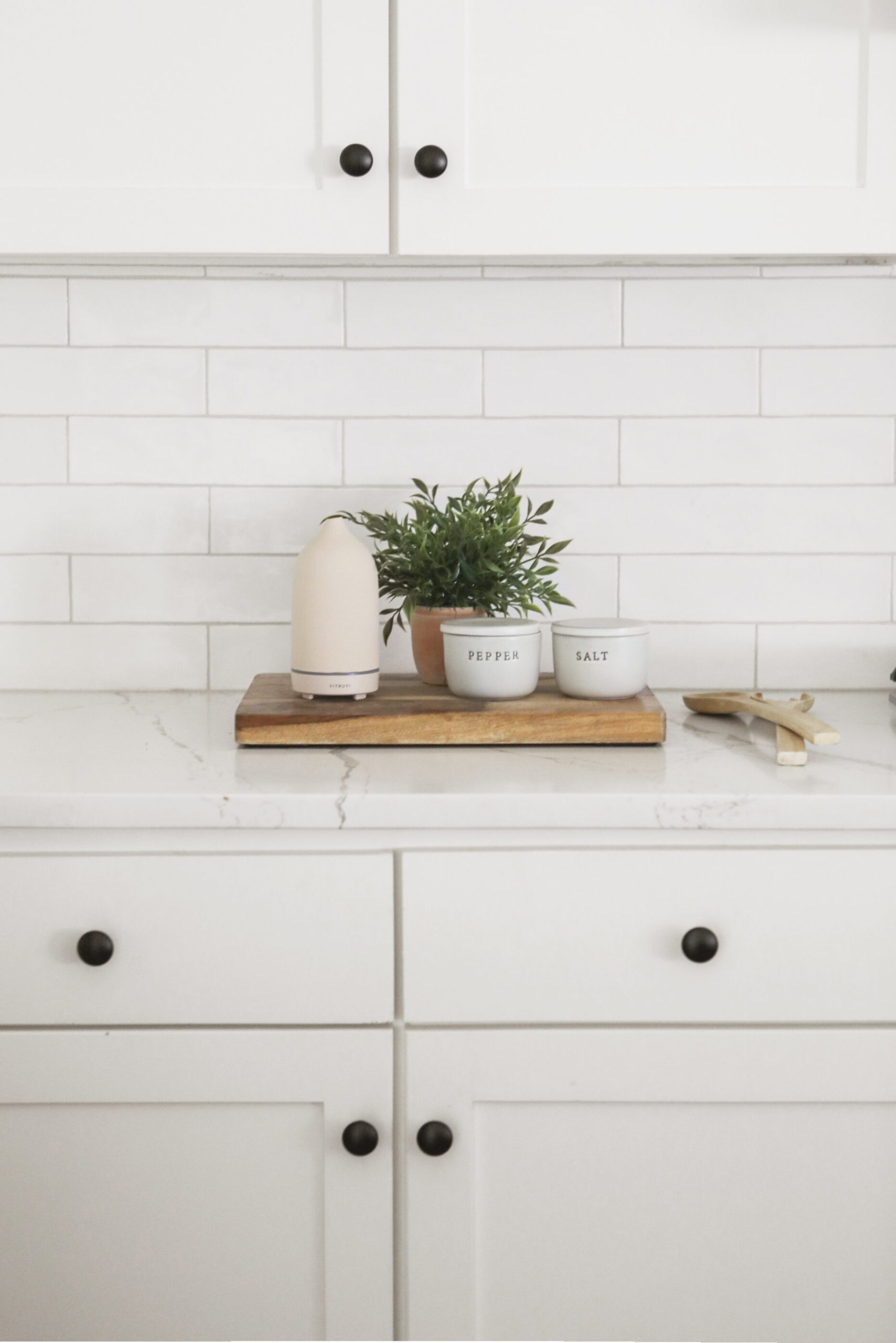
While I knew I wanted a classic, mostly-white kitchen, I always love materials that have imperfections and movement. This tile from Floor & Decor was so affordable, and each piece has a subtly unique shape. We went with a mid-tone gray grout color to quietly accentuate the handmade lines in the tile.
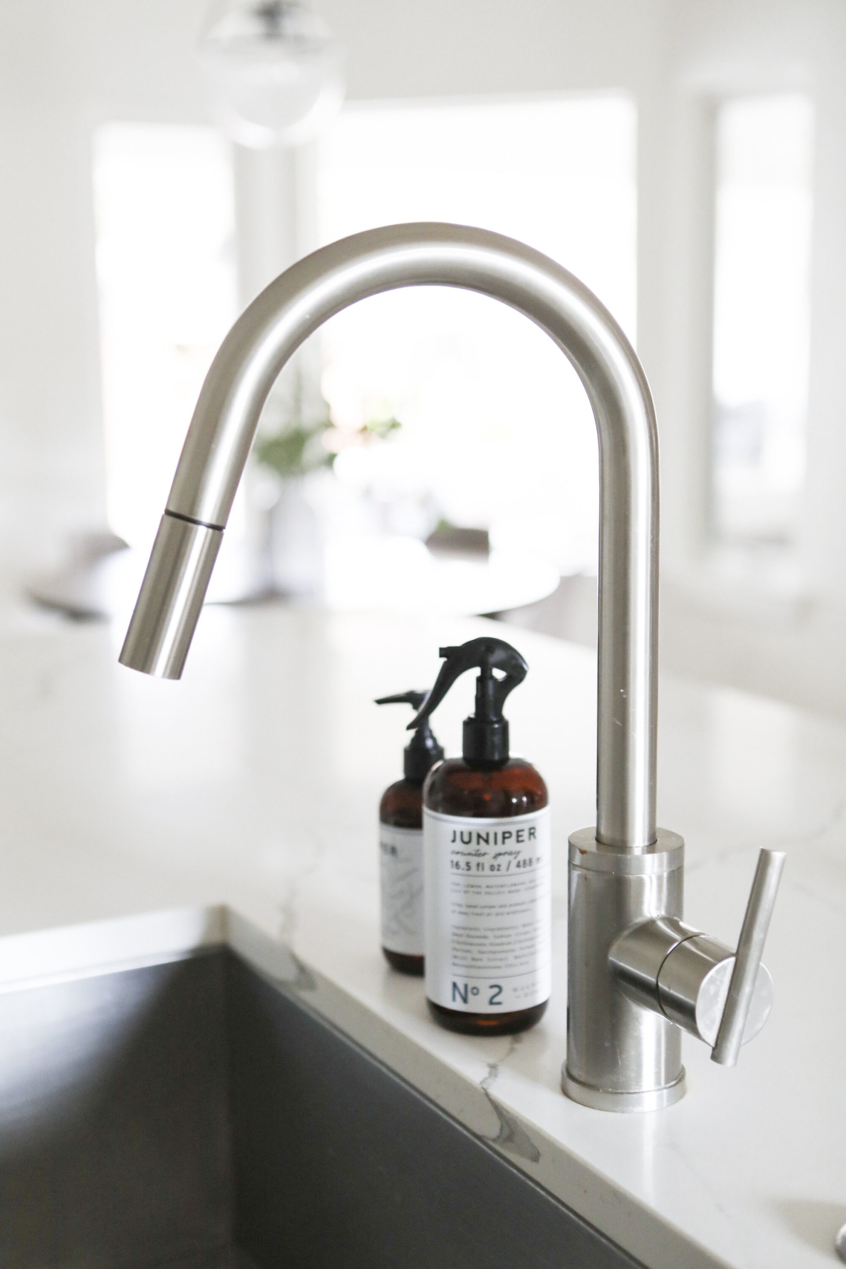
People have FEEEELINGS about which kind of sink works for them, and I’m no different. I’m Team One Large Basin for life. I love being able to drop my huge pans and pots into it to soak. Also, that Juniper sent from Magnolia is incredible, and you need to buy all of it right now.
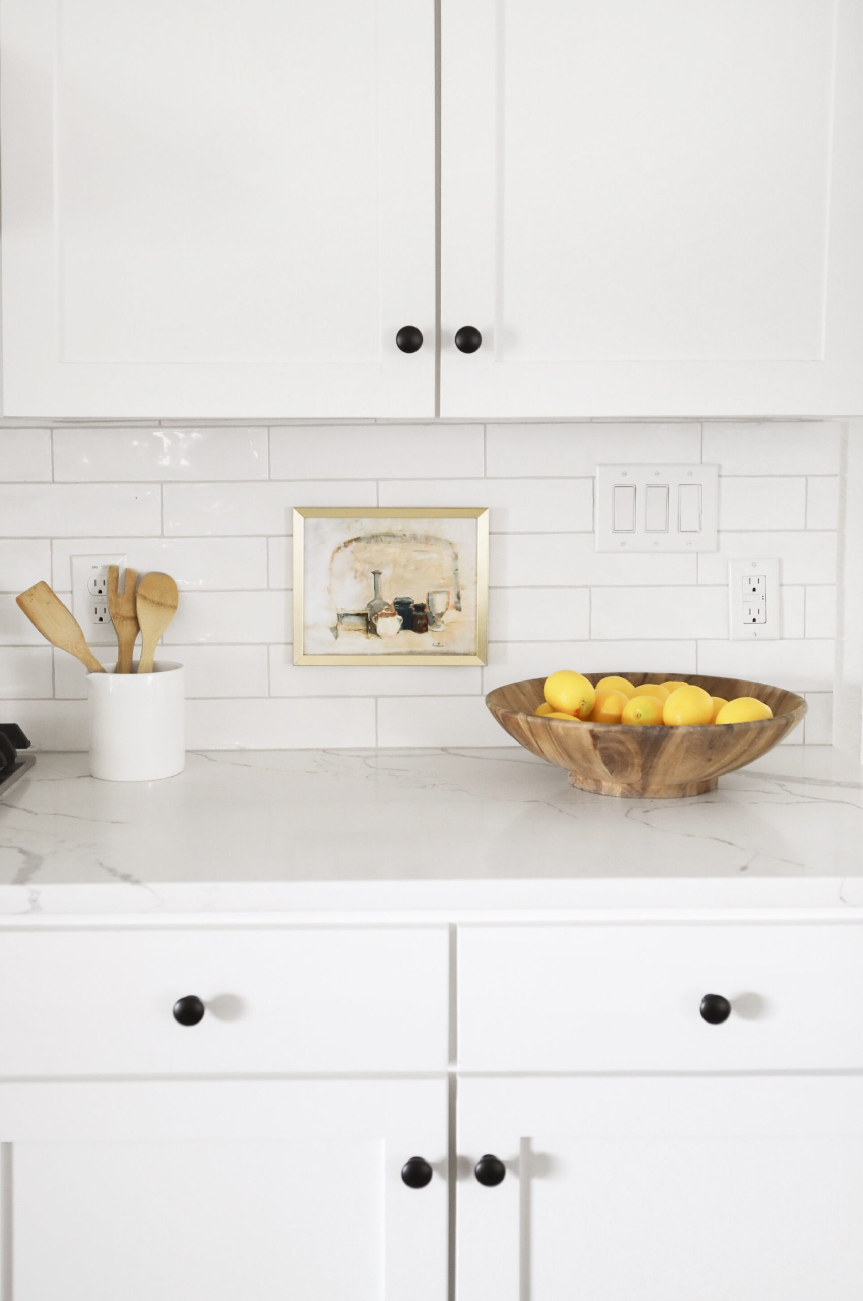
Utensil Crock (similar) // Art (unavailable, but similar here) // Frame // Wood Bowl (similar)
Art in the kitchen has gone from “fun new trend” to “absolute MUST”. If I’m you I’m thinking, “Sure, but I don’t have vintage oil paintings just hanging around. Plus, I’m not pumped about the idea of damaging my backsplash to make this happen.” I hear you, but I promise this is so easy to recreate. Download a vintage oil print (this one would be perfect in a kitchen), put her in a simple frame, and attach to the wall or backsplash using velcro command strips. Done and done – no need to even leave your home.
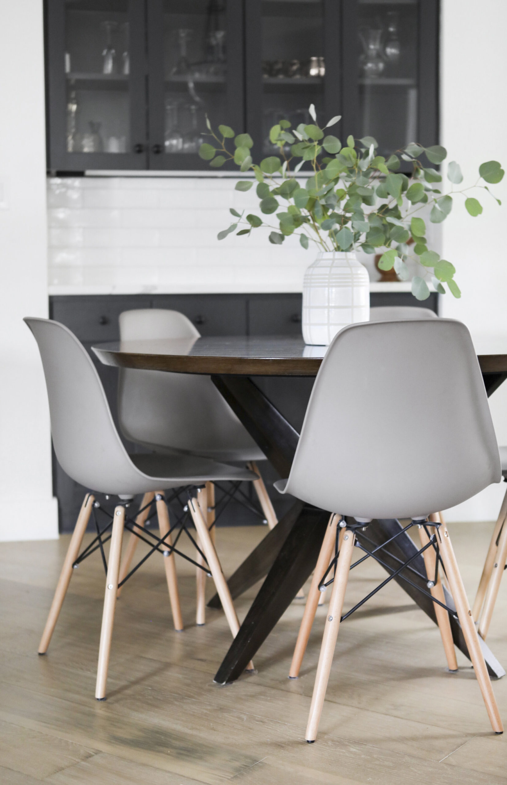
Dining Chairs // Dining Table // Vase (unavailable, but similar here)
We call this the “breakfast nook”, but truly it’s the “basically everything” nook. This is where we eat 90% of our meals, do a lot of homework, experiment with play-doh, and have some of our goofiest (and most meaningful) family chats. The architecture of the space pretty much demanded a round table, so I made sure to get one that was large enough to fit our whole family (50 inches is a great diameter for seating 5-6, given you have the right chairs).
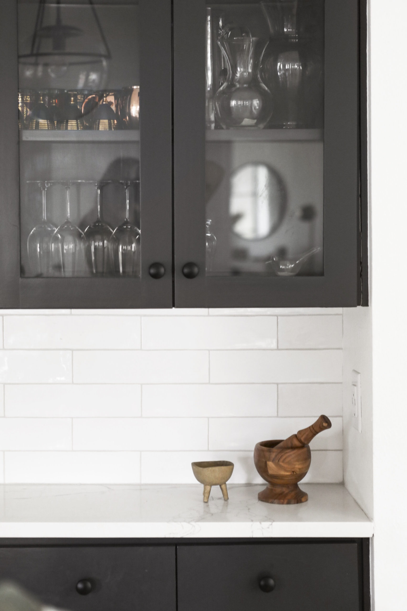
Footed Bowl (similar) // Mortar & Pestle (similar)
At first I was thinking I would do brass hardware in the island and breakfast nook cabinetry to add contrast with the dark paint color, but at the last minute I decided to keep using the matte black knobs throughout. I have to say, I still really dig the tone-on-tone look in those areas.
Sources for most everything can be found below each picture, but here are a few of the broader specifics:
Builder: Axiom Builders (cannot say enough wonderful things about Preston and his team)
Walls, ceiling, and perimeter cabinets are painted Chantilly Lace by Benjamin Moore.
Island and breakfast nook cabinets are painted Cheating Heart by Benjamin Moore.
Floors are an engineered white oak that has stopped being made. However, I’ve used this product in multiple projects and honestly wish I could go back in time and use it in our home (better quality, and I love the tone of the wood more).
So, there she is, friends. Our family’s kitchen and breakfast nook. A lot of times, kitchens simply need some cosmetic updates (paint, hardware, countertops, etc.) to look new, but as you can see from the before shots, this one just needed a fresh start and clean slate. I’ll be back soon to show you the dining room + entryway, so stay tuned!
xo,
sarah
Love this! Thank you for sharing. I live in Dallas and we are considering buying a fixer-upper like this, so I appreciate the local sources!
Hi Taylor!! Thank you so much for reading! There are still lots of other parts of the house to share, so stay tuned!