Back to revisit one of my favorite projects to date, The Carriage Hills Project. And today, I’m walking you guys through all the details of the kitchen.
Let’s see how it started
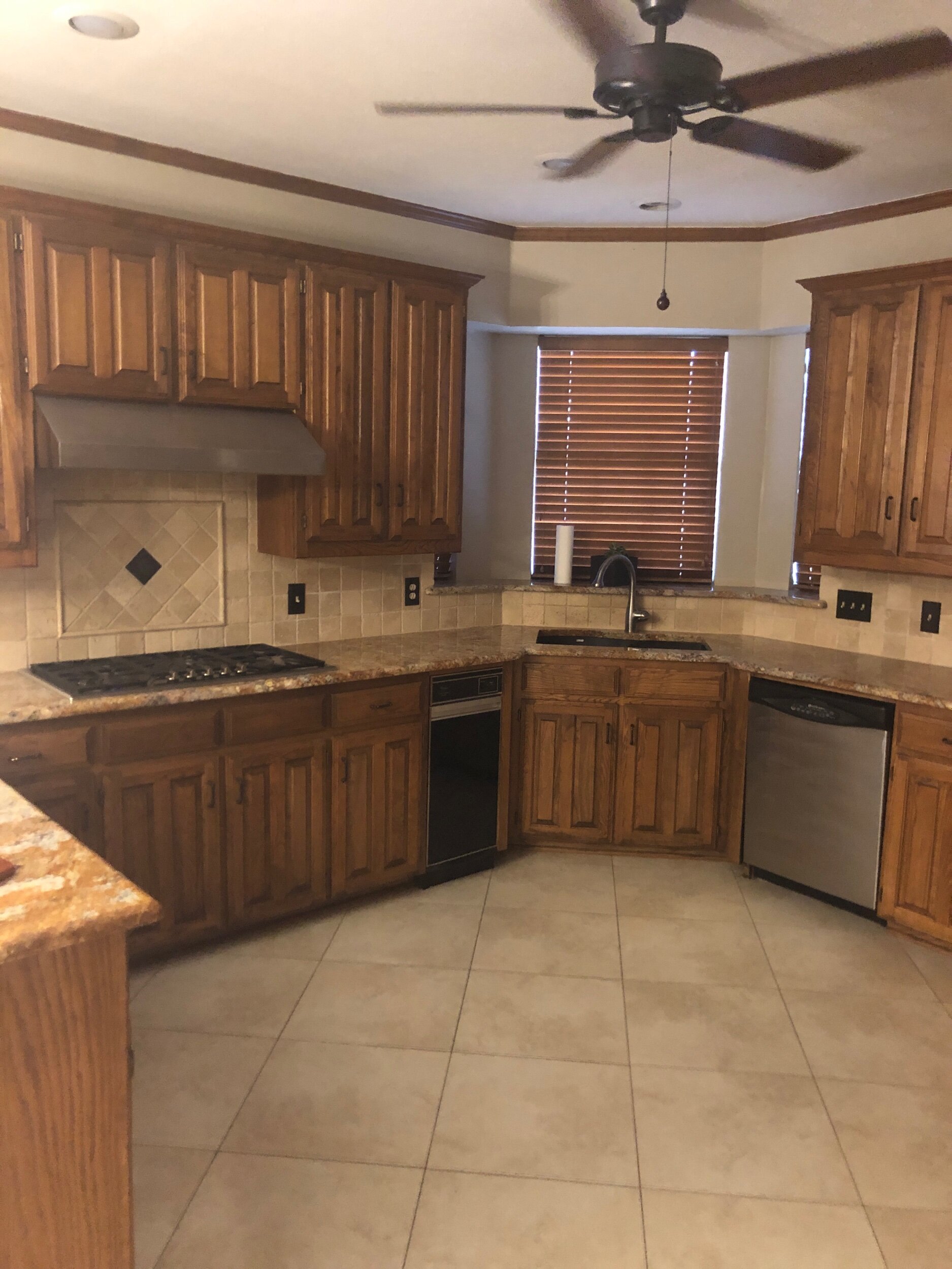
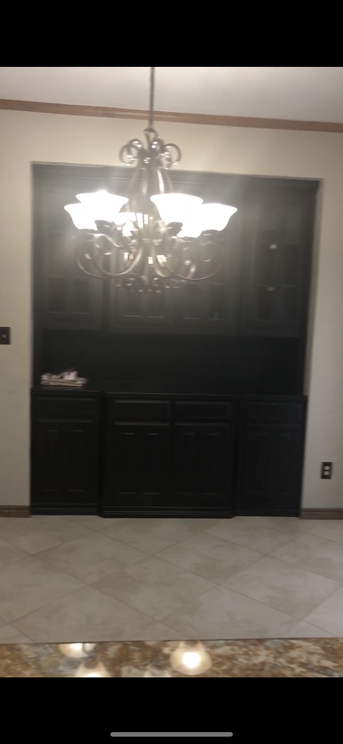
Not terrible, not great. We were working with a builder-basic 80s spec kitchen, essentially. Honey-toned cabinets, the least expensive granite possible, questionable details (looking at you, ceiling fan), and just bad tile. BUT, the layout works.
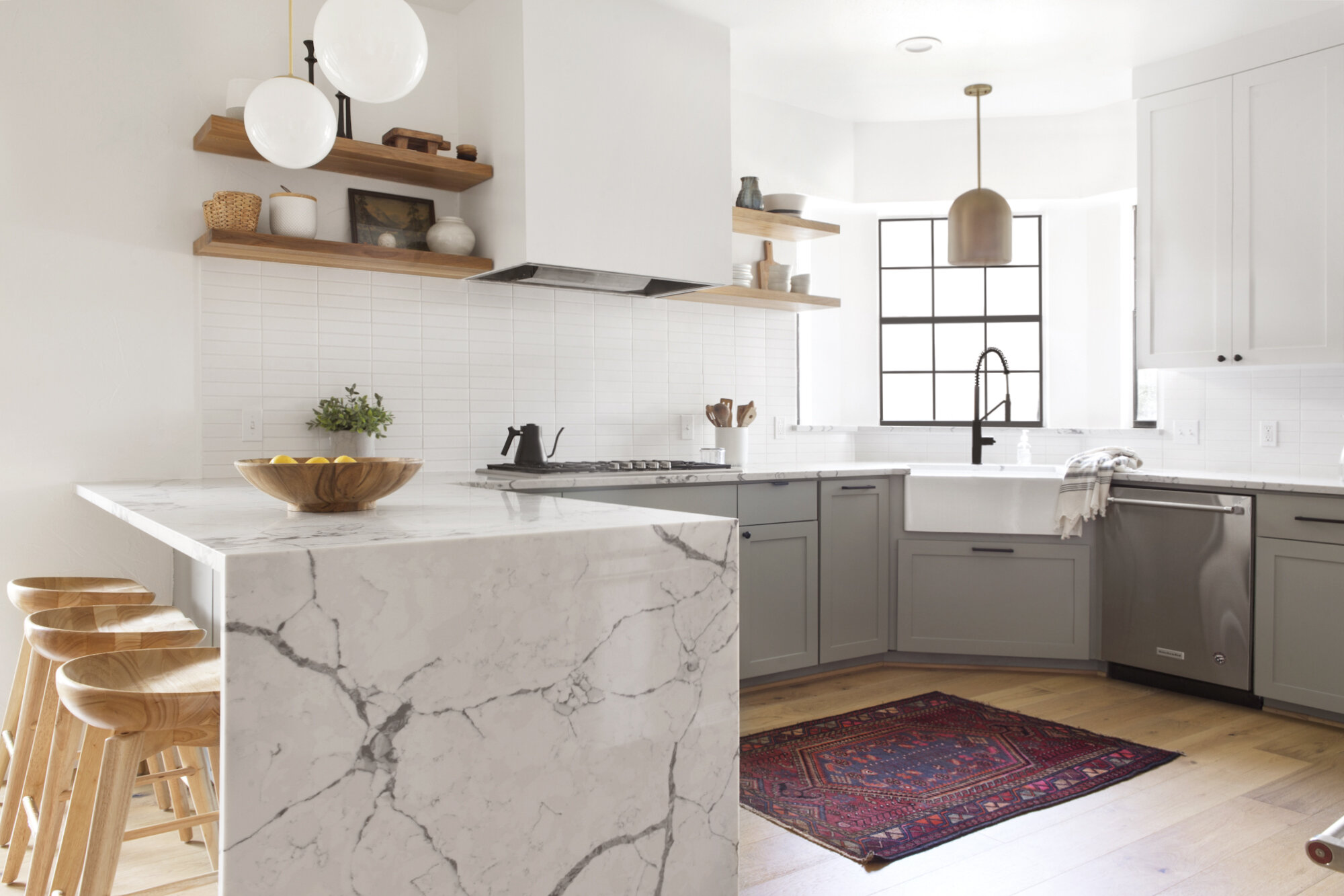
We wanted to bring up the style level about 1000 notches, and I definitely feel like that was achieved. This family is super cool and loves midcentury design, so we were able to bring in hints of that style in the globe pendant lights and minimal stacked subway tile.
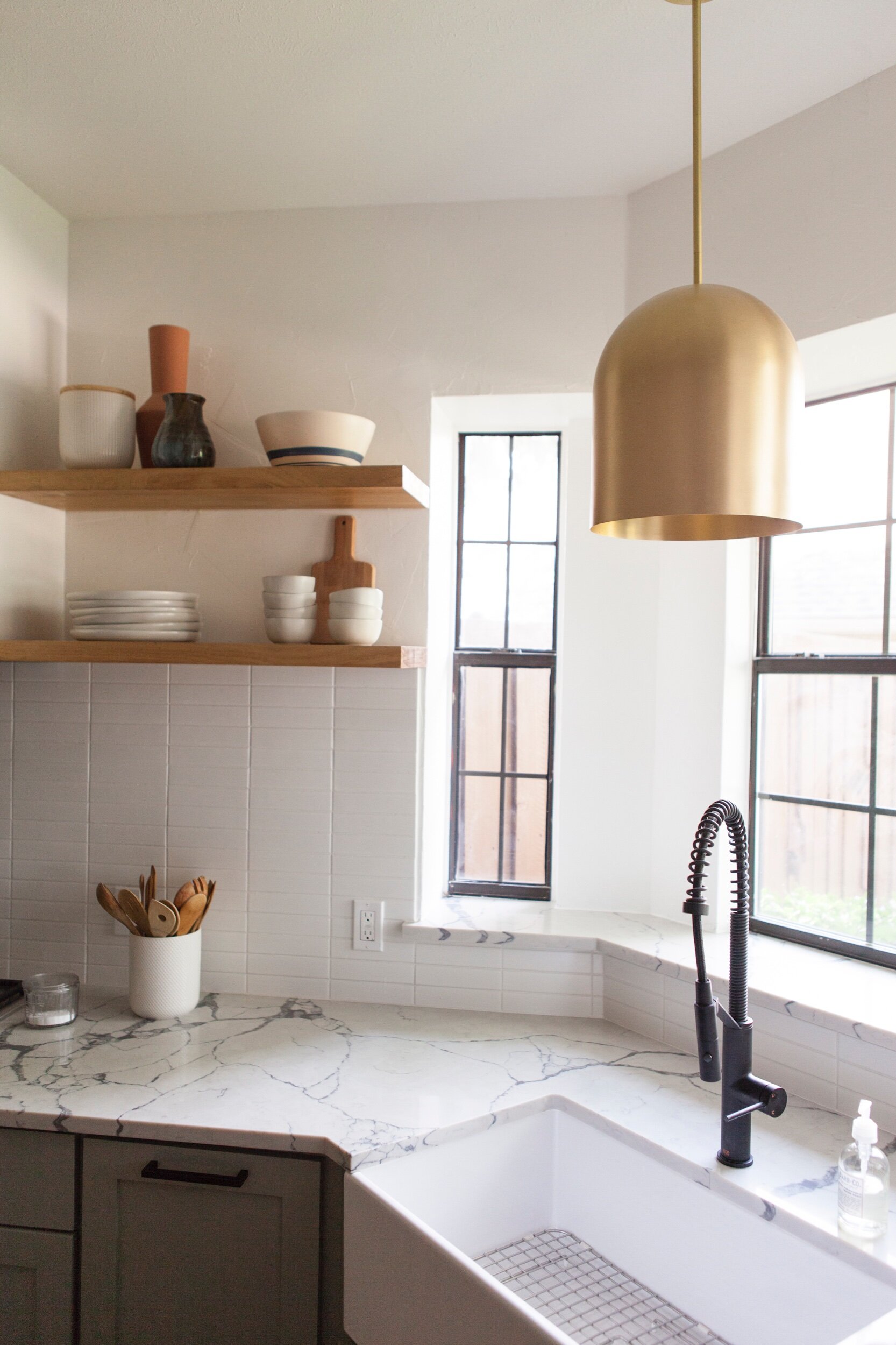
The quartz we used in this home is my absolute favorite in the history of quartz. Passes for a dramatic marble, no question.
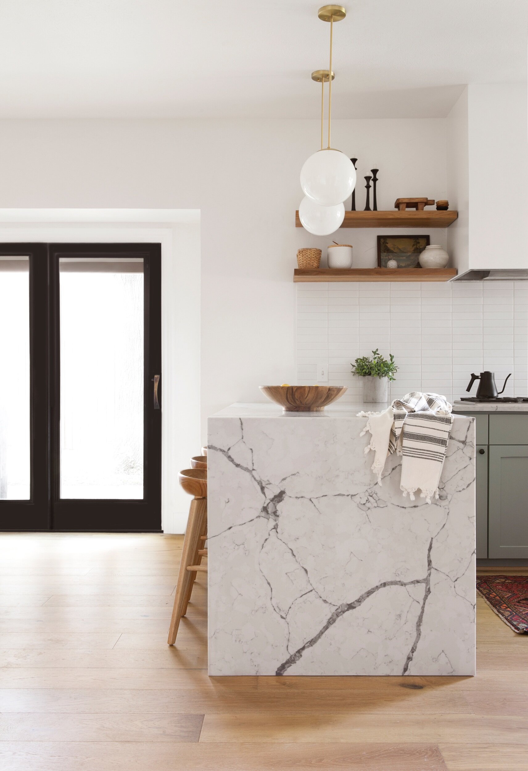
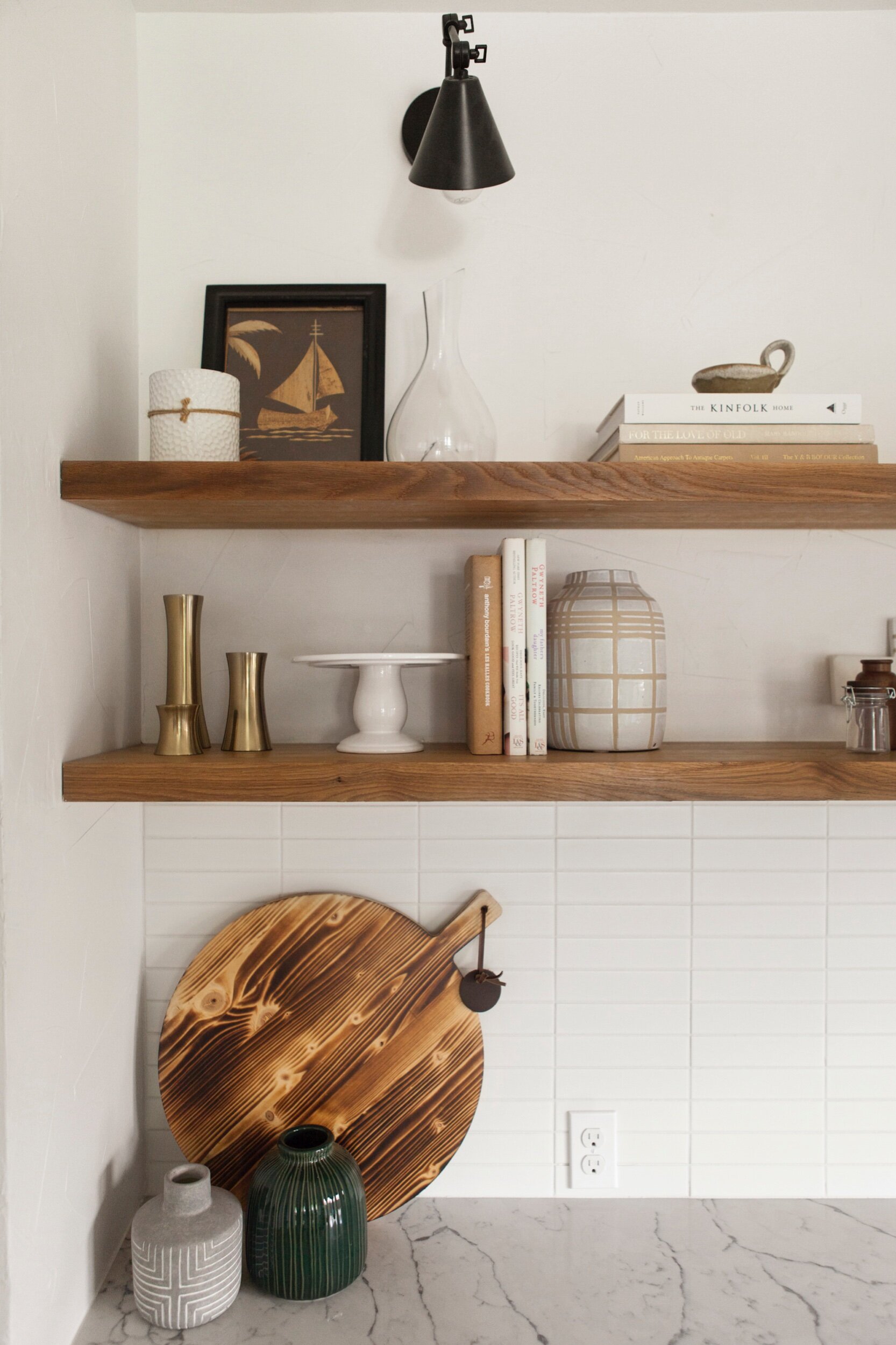
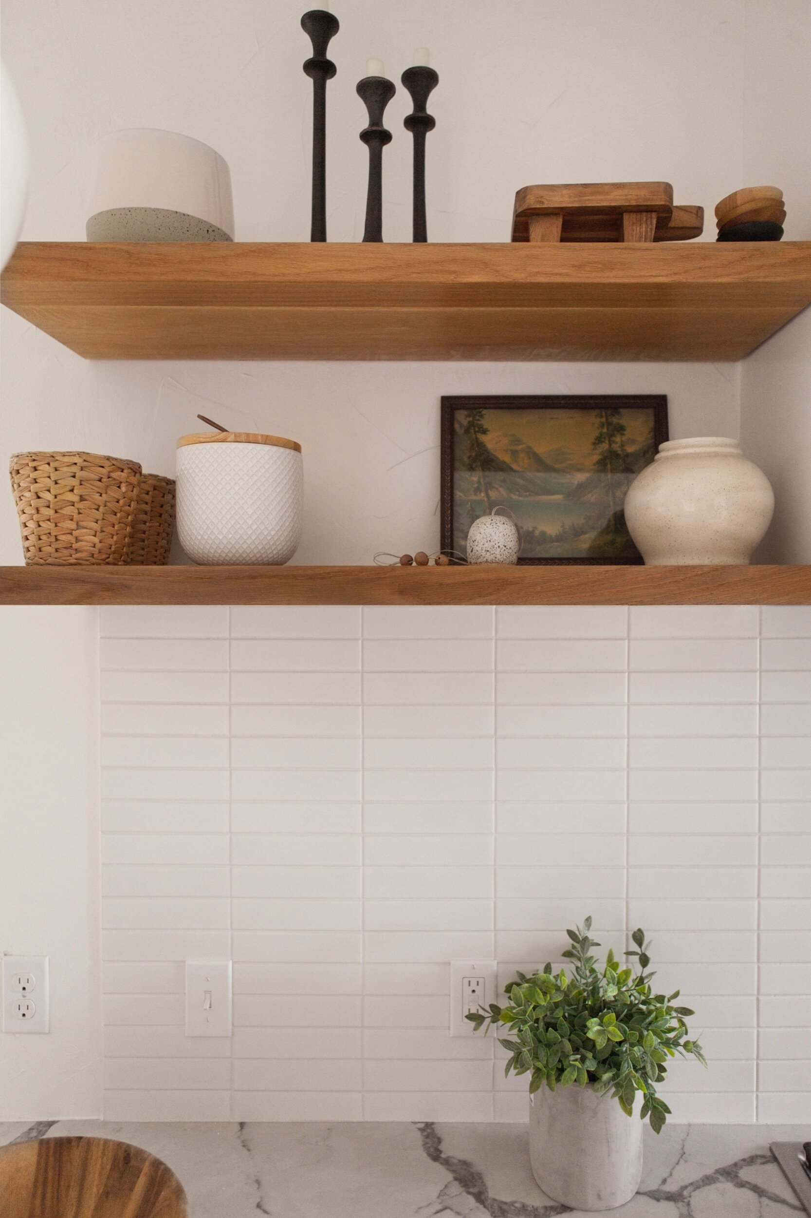
Because this kitchen already had tons of storage (there’s a whole wall of upper and lower cabinets you can’t see in these photos) we were able to bring in open shelving. These let us add function AND style in a really unique way. Bringing in vintage decor pieces and art help warm the space (which would otherwise feel a bit stark).
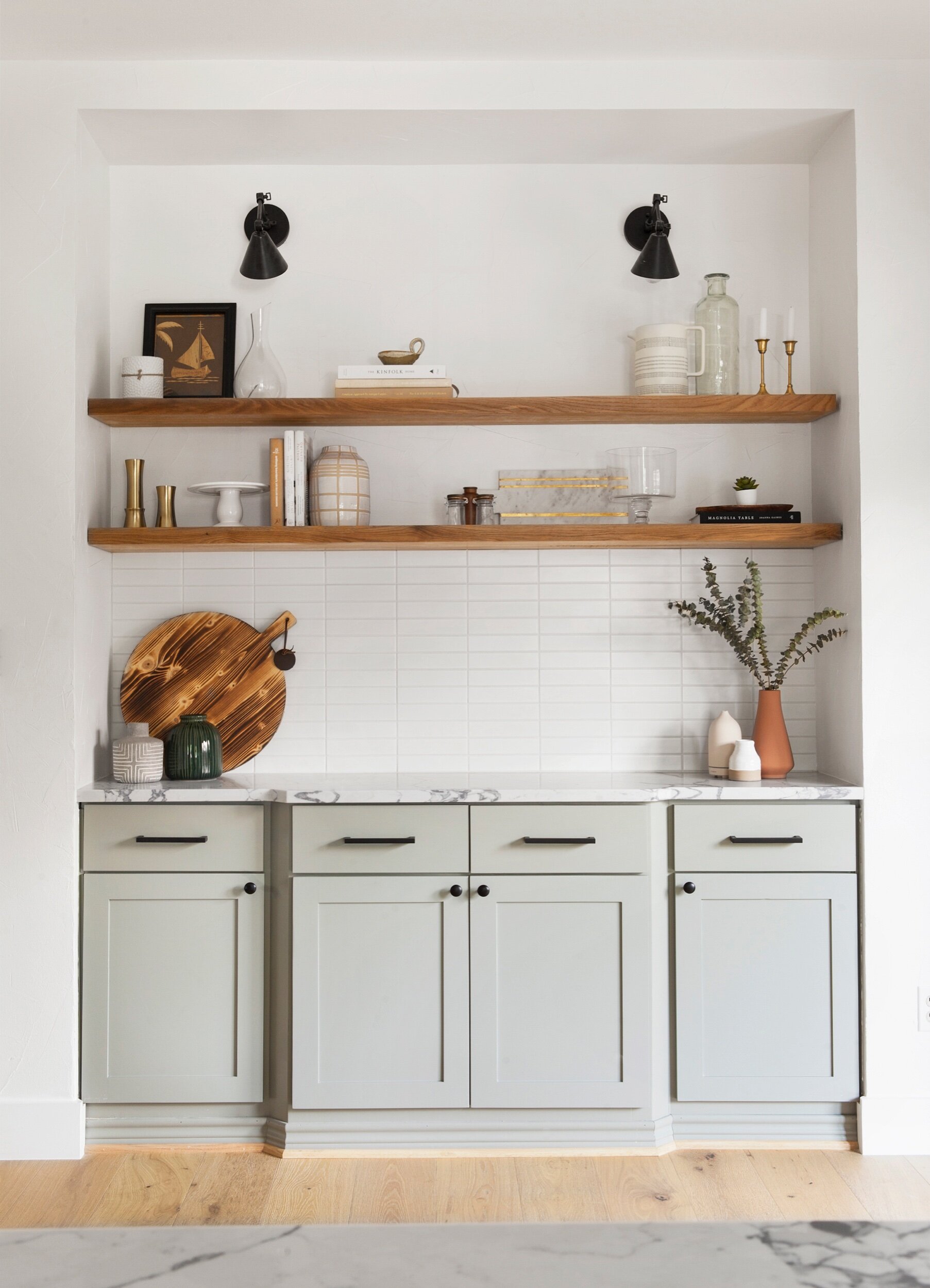
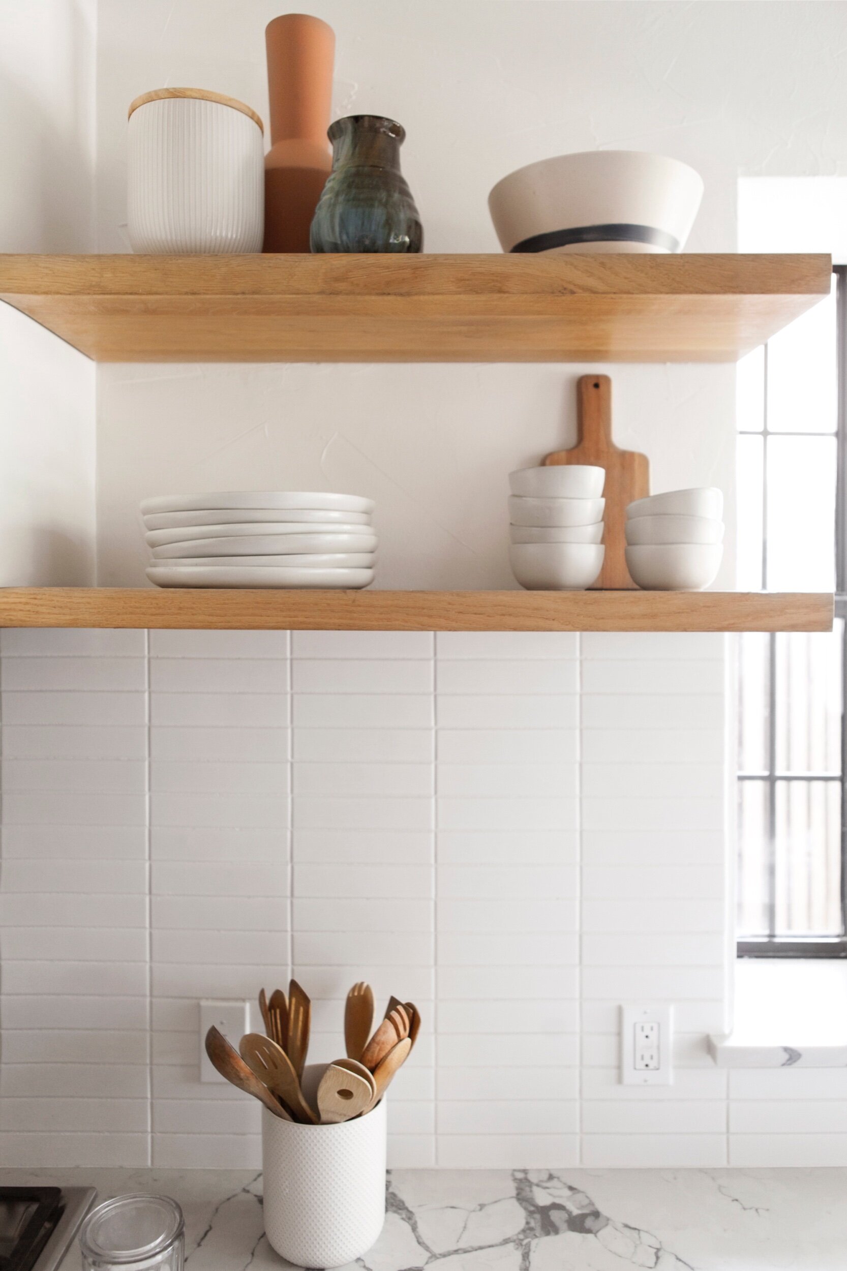
One of my favorite money-saving renovation tips is to replace cabinet fronts instead of entirely new cabinet structures. It’s so much more cost-effective, and completely gives the appearance of new custom cabinetry.
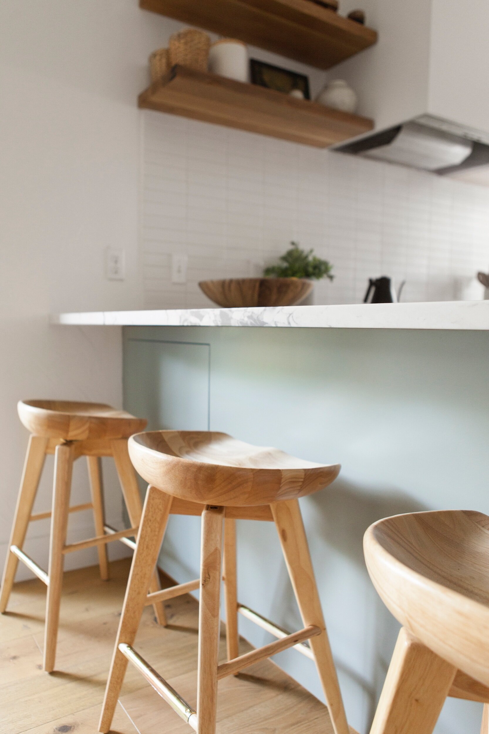
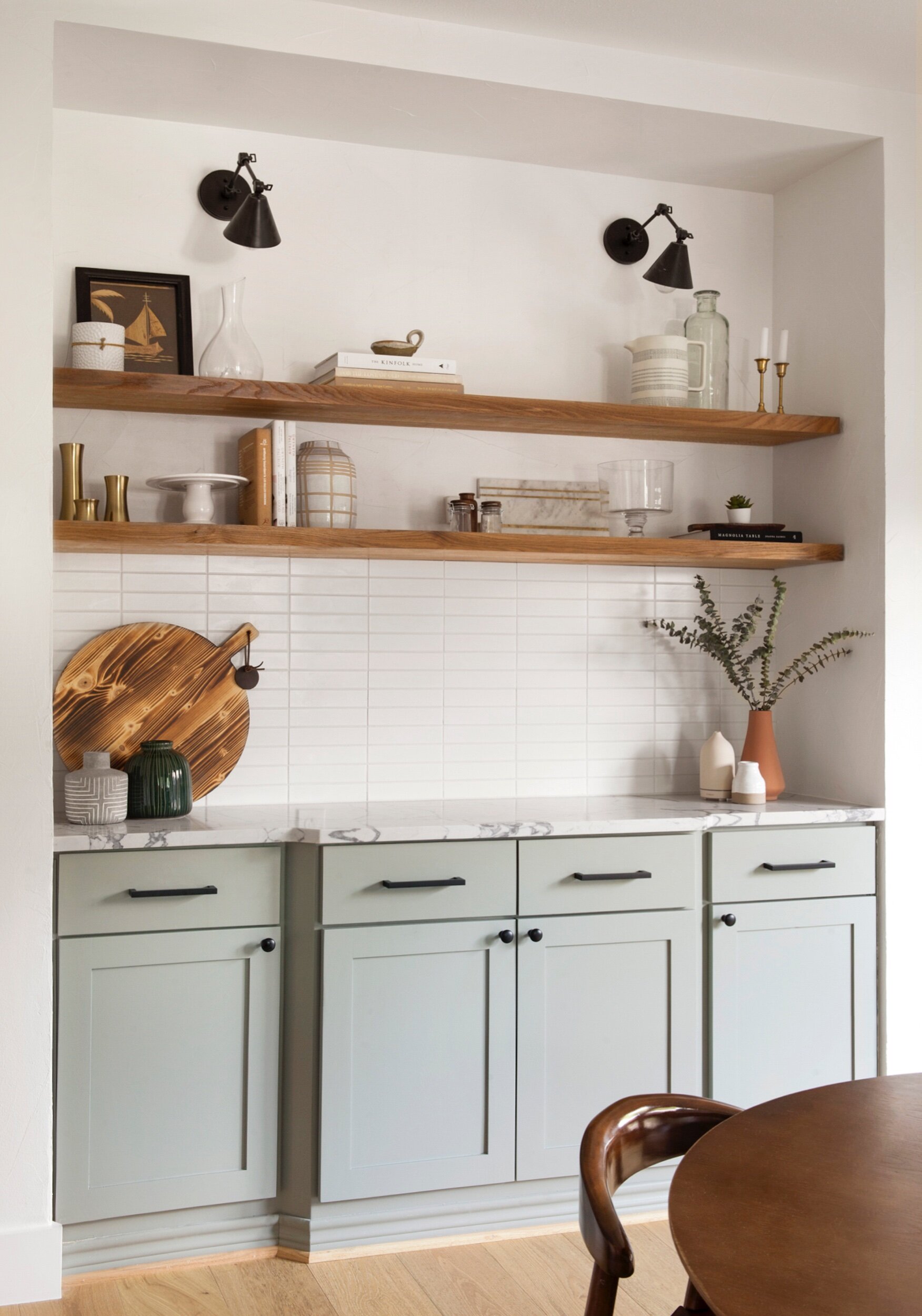
See below for allll the details. Did I leave anything out? Be sure to comment below and I’ll absolutely help fill in the gaps!
Builder: The Chatham Collective
Photography: Matti Gresham
Wall Color: Chantilly Lace by Benjamin Moore
Cabinet Color: Pigeon by Farrow & Ball
Patio Door Color: Tricorn Black by Sherwin Williams
Floating Shelves: custom by builder; rift sawn white oak with a clear matte seal
Counter Material: Calacatta Lago quartz from MSI
Backsplash Tile (discontinued, but I’d use this if doing it over again)
Hello, great work, it looks beautiful! Quick question, is the kitchen backsplash a 2×8 matte tile? Or is it glossy? Also, what grout did you use? Thanks!
Hi Sarah! This kitchen is beautiful, we are using it as inspiration. The pigeon colour shows up a bit darker in our kitchen than in these photos, would you suggest asking the paint store to lighten it? Also, what colour white is the top cabinets? Thank you!!