I’ve been in this design game for a minute now, and it struck me recently how often I’m discussing the same handful of concerns with my clients. It doesn’t matter whether you’re building a new home, renovating an existing one, or simply picking out new accessories to freshen up a lackluster space: there are three main quandaries you are very likely to encounter. As I’ve gained more practical experience and confidence, I wanted to share how I help my people sort through these thoughts and move forward on decisions.

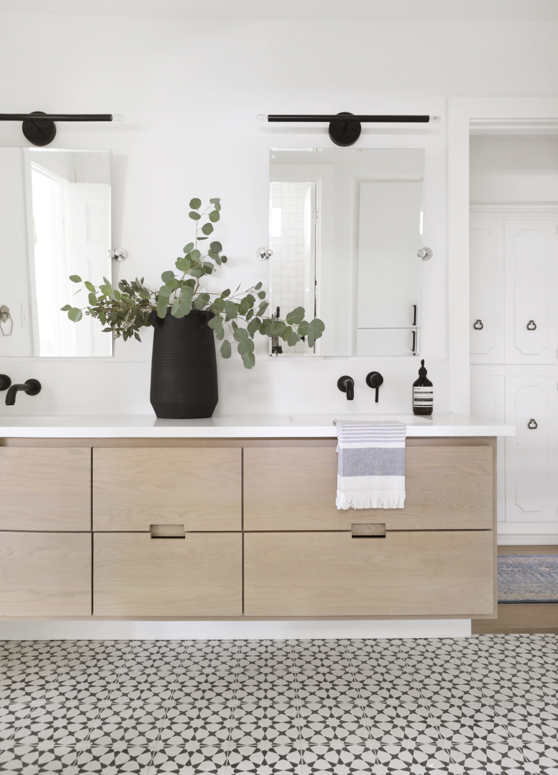
Our jack-and-jill bath // Photographed by Matti Gresham
“I love it, but is it too ‘much’? Will I get sick of seeing it every day?”
This thought usually accompanies a bolder design plan. Think a graphic pattern on a tile, a sofa with an unusual silhouette, a striking paint color. The key part of this concern is that first statement: I love it. After multiple projects in which my clients have decided to “go for it” with me, there has never been regret. We tend to snuff out that quiet thrill when we see bold design that makes our heart beat faster, in favor of being “practical”. But choosing pieces and finishes that we truly love is the most practical thing you can do. The safe, practical, most likely belabored designs that we often settle for are what we’ll be sick of seeing every day (which, of course, makes them very UNpractical).

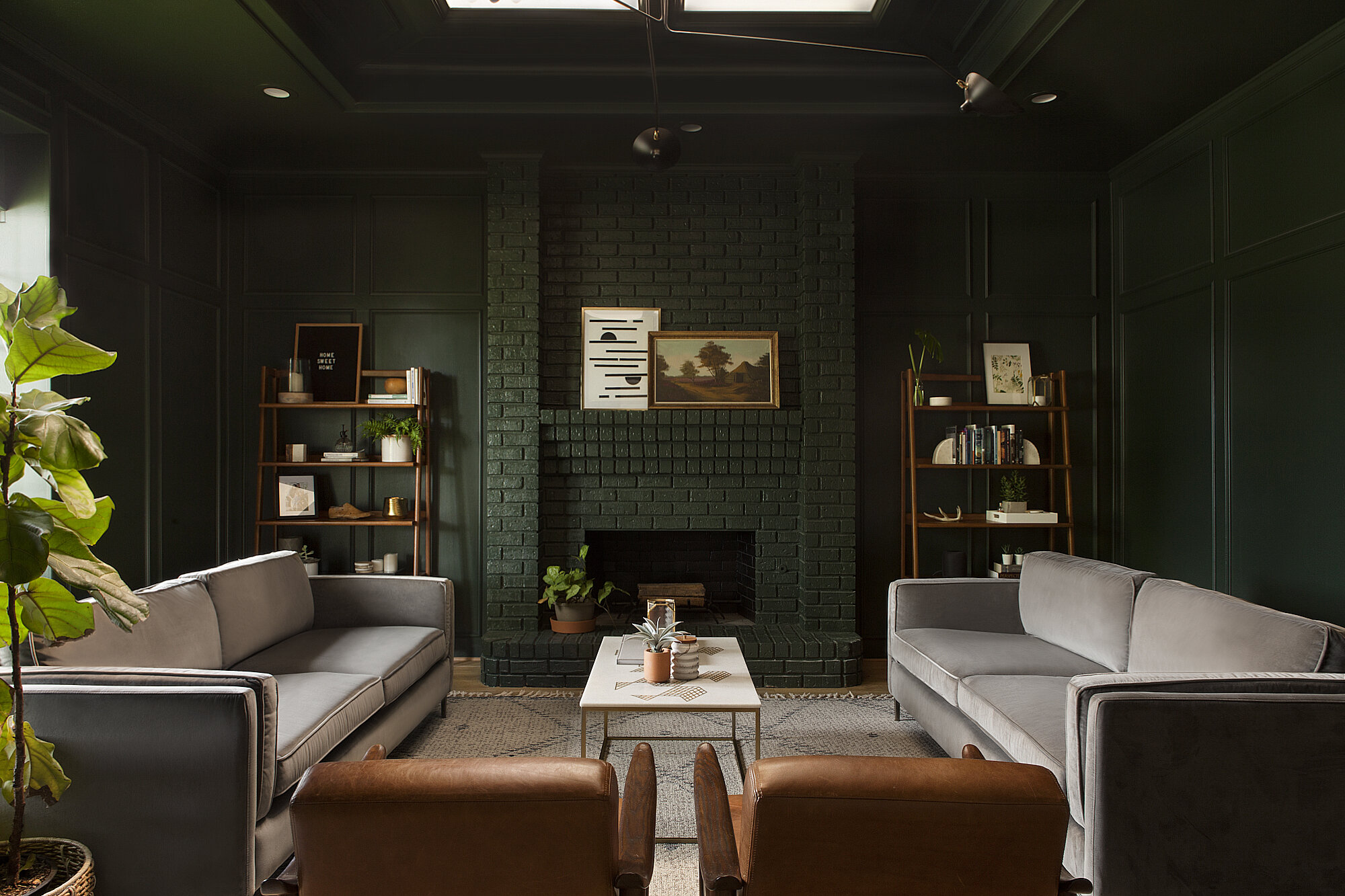
Carriage Hills Project Living Room // Photographed by Matti Gresham
”Is it too trendy? Is this on its way out?”
No one wants to be basic, and absolutely no one wants to be dated. If you’re about to make a financial investment in your home, you definitely want to have time on your side. So how does one make bold design choices and take those aforementioned risks, without being left behind and becoming part of a design moment-in-time? Interestingly, and somewhat counterintuitively, it is by not taking risks and trying to appeal to a broad anonymous “mass” that will date you. Let’s take kitchens for example. Hold in your mind the “dated kitchen”. The image in my head has tan granite (with no movement), maple cabinetry, polished nickel hardware, faux-Tuscan light fixtures… I guarantee none of those elements was brought in because someone personally loved it. The decision maker here had cost, mass appeal, reproduction, and availability in mind – the end. So avoid the potential of designing a space already on its way “out” by trusting your gut, leaning into those brave choices that YOU LOVE. One more critical piece of advice here: consider history. Sticking with the kitchen example, take a look back at kitchens of old for inspiration. Vintage Americana, old English cottages, Moroccan palaces: all these will provide truly timeless designs that have virtually zero chance of going “out of style” since they, in fact, defined style. A common theme of them all? A reliance on natural finishes (stone, wood, clay, etc.) that patina over time. Stick to these things and you really can’t go wrong.

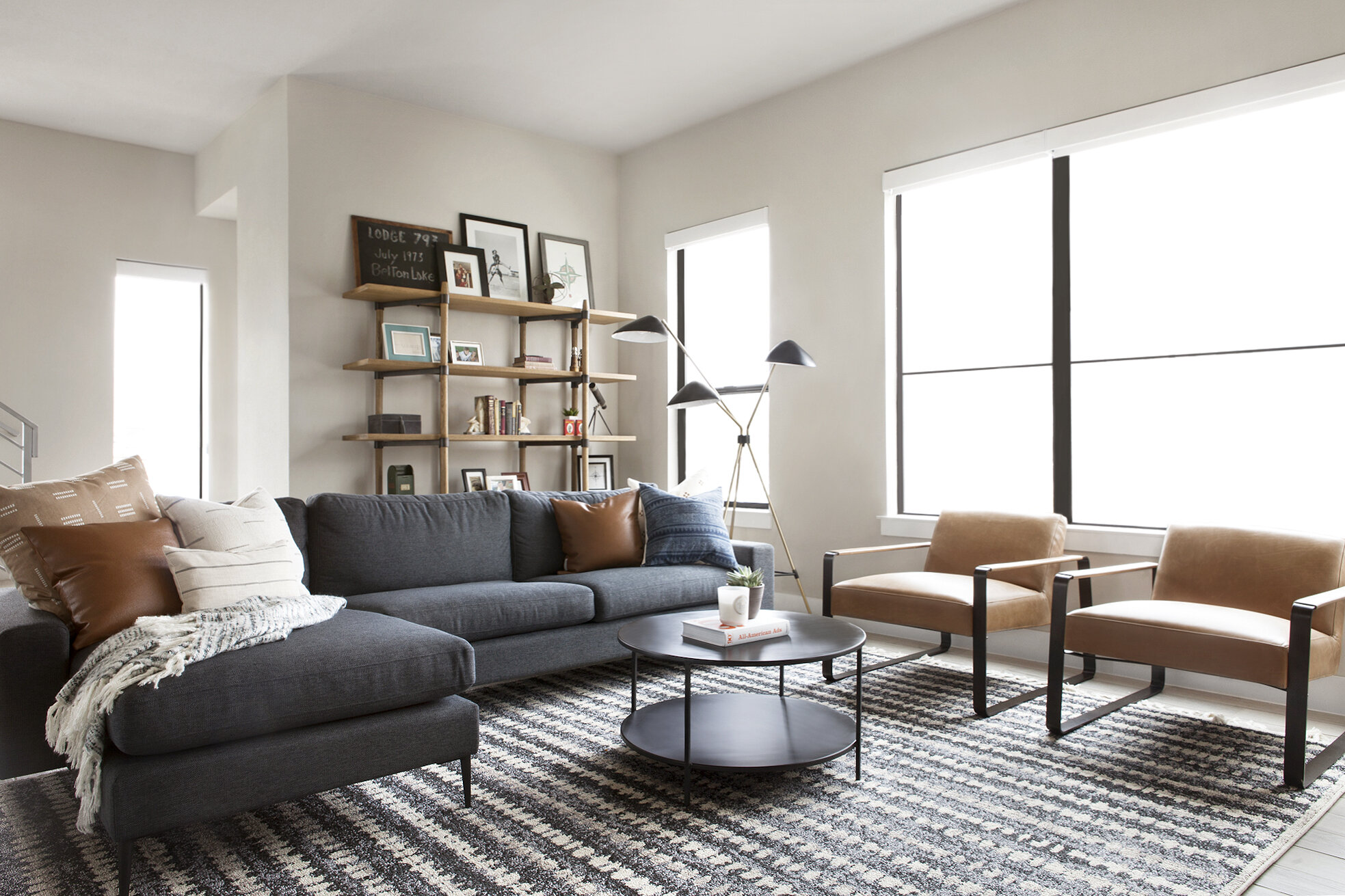
Deere Project Living Room // Photographed by Matti Gresham
“Where should I save? Where should I splurge?”
This is such an important question. There is no point in renovating or refreshing a space if it leaves you financially strapped and anxious in the end. Having a clear budget – and sticking to it – is key. But how do you know what amount to allocate to which portion of the design? For renovations, I recommend investing in quality flooring and windows (especially windows in the front of the home). While there are a lot of really beautiful inexpensive flooring options out there, quality will win out in the end. Where can you save? Lighting and tile. Places like Shades of Light, Lucent Lightshop, and even (if you’re willing to dig) Wayfair have really upped the affordable lighting game. Similarly, Floor & Decor and Bedrosians are putting out really beautiful tile products that are consistently knocking my socks off. For furnishing projects, this might be controversial, but I love investing in a great arm or accent chair. One would immediately think to invest heavily in a larger piece like a sofa, but a) I think sofa silhouettes change frequently and can age out, whereas armchairs hold onto history longer; b) there are already places like Article offering affordable and well-designed sofa selections; and c) an armchair is far more versatile than a sofa (you can move a chair to basically any room, but a sofa really only belongs in a living room).
So, my dears, in summary: do your research (check out design books from the library, take photos, pin pin pin), know what you love, lean into risk, value natural elements, and stick to your budget. I have extreme confidence that sticking to these principles will not only relieve you of design anxiety, but will deliver you results that will feel inspired, unique, and make you proud.
Did I miss any of your concerns? I’d love to answer them in the comments, if so!!
xo,
sarah
Such great advice! Especially about how to avoid being too trendy….you’re so right! Can’t wait to put these tips into practice on a future reno.
Hi! I was wondering if you could post the link for the stacked subway tile used for the kitchen backsplash? It’s beautiful! Thank you!
Dominique