photos by Matti Gresham
Happy Monday, people. How was your Easter? I was sad/nervous about not spending it with our church family, but praise God for technology, live-streaming, homemade biscuits, and unexpected sunshine. It ended up being a really special day, and I’m truly so grateful.
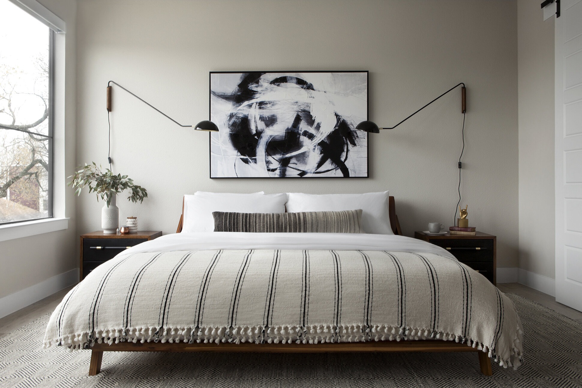
I’m back at it today with the third – and final! – full reveal of the Deere Project: the master bedroom (be sure to check out the living room and kitchen + dining reveals if you missed those!). I’ll be honest: I think bedrooms can be hard to design. The goal is usually to make them functional AND beautiful; hotel-esque, but NOT art museum; formal, yet somehow also casual…? It can just get tricky. All that to say, I spent so much time on this design, and actually went through several different options (with myself) before finalizing this one. You know how sometimes you do something, and it feels right, but then time goes by and you regret SO much of it? Yeah…that didn’t happen here. I STILL LOVE IT SO MUCH.
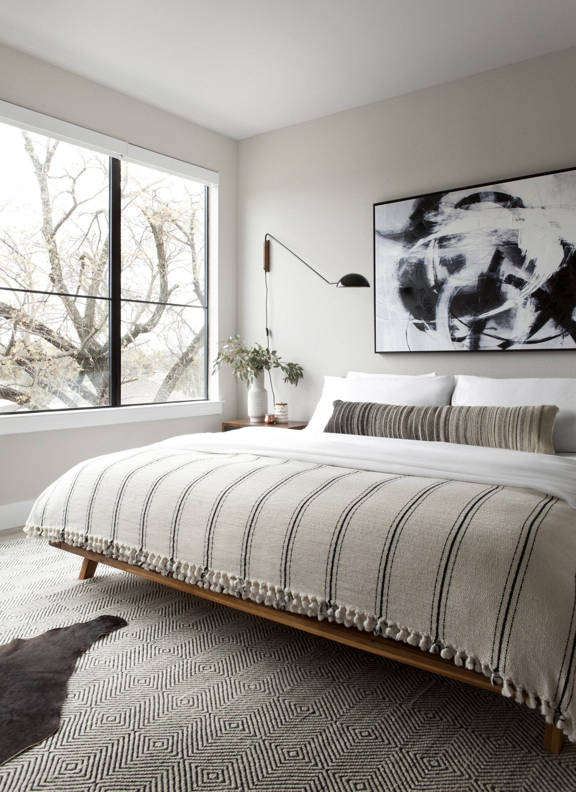
I’ve said it before on Instagram, but it bears repeating: you cannot go wrong with white sheets, oversized lumbar, and neutral blanket for your bedding combination. Truly works every time.
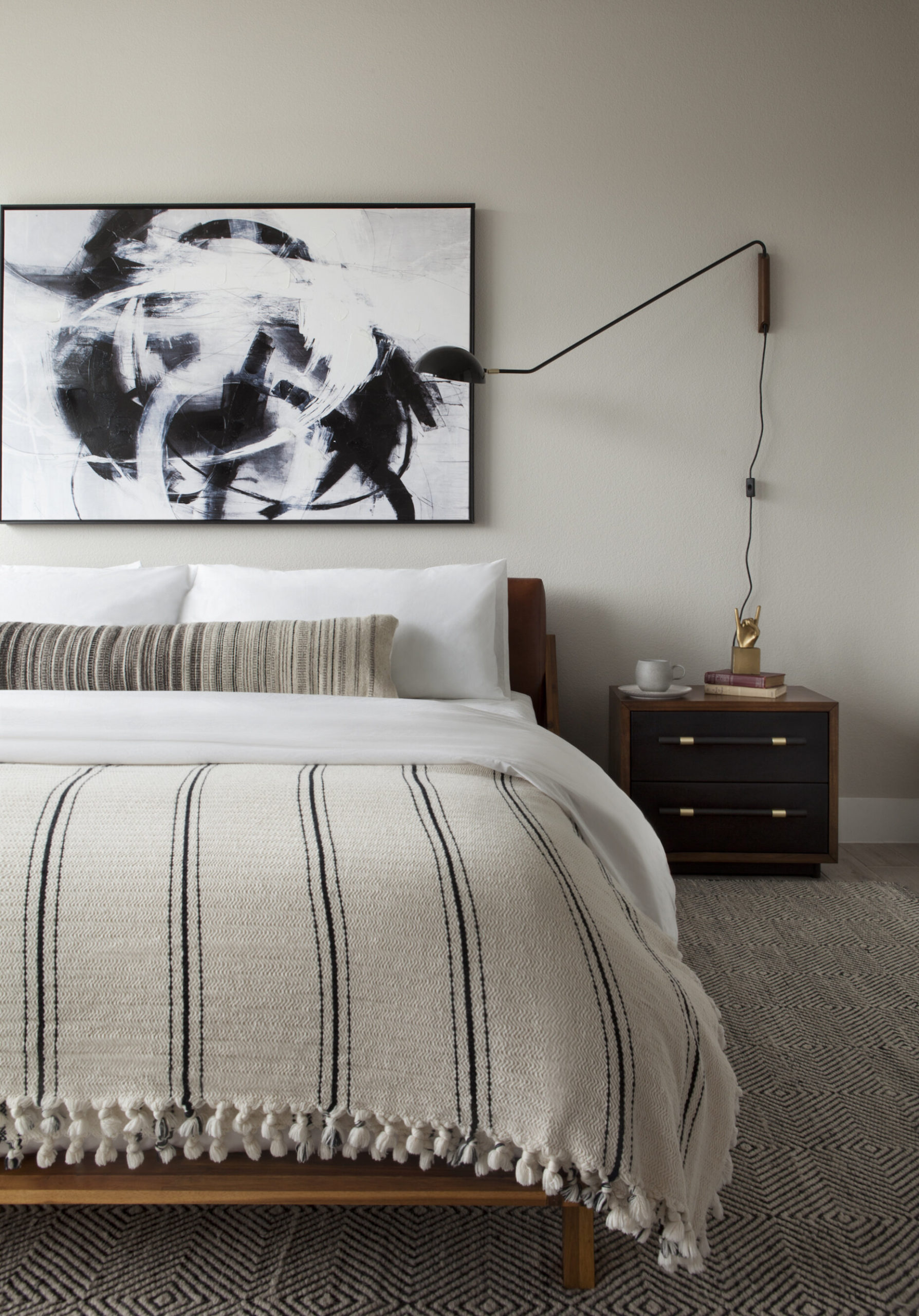
Nightstand // Bedding // Lumbar Pillow // Blanket (similar, but less than $50) // Bed // Art // Wall Lamp // Rug
Speaking of “oversized lumber”, this one is from The Citizenry, a Dallas company that travels the world to partner sustainably with local artisans (and use only local materials) to create stunning, handcrafted pieces. The level of elegance and excellence is really just out of this world. They have a ton of these special lumbars (that braided leather one has my name all over it), but I want just about everything from their shop!
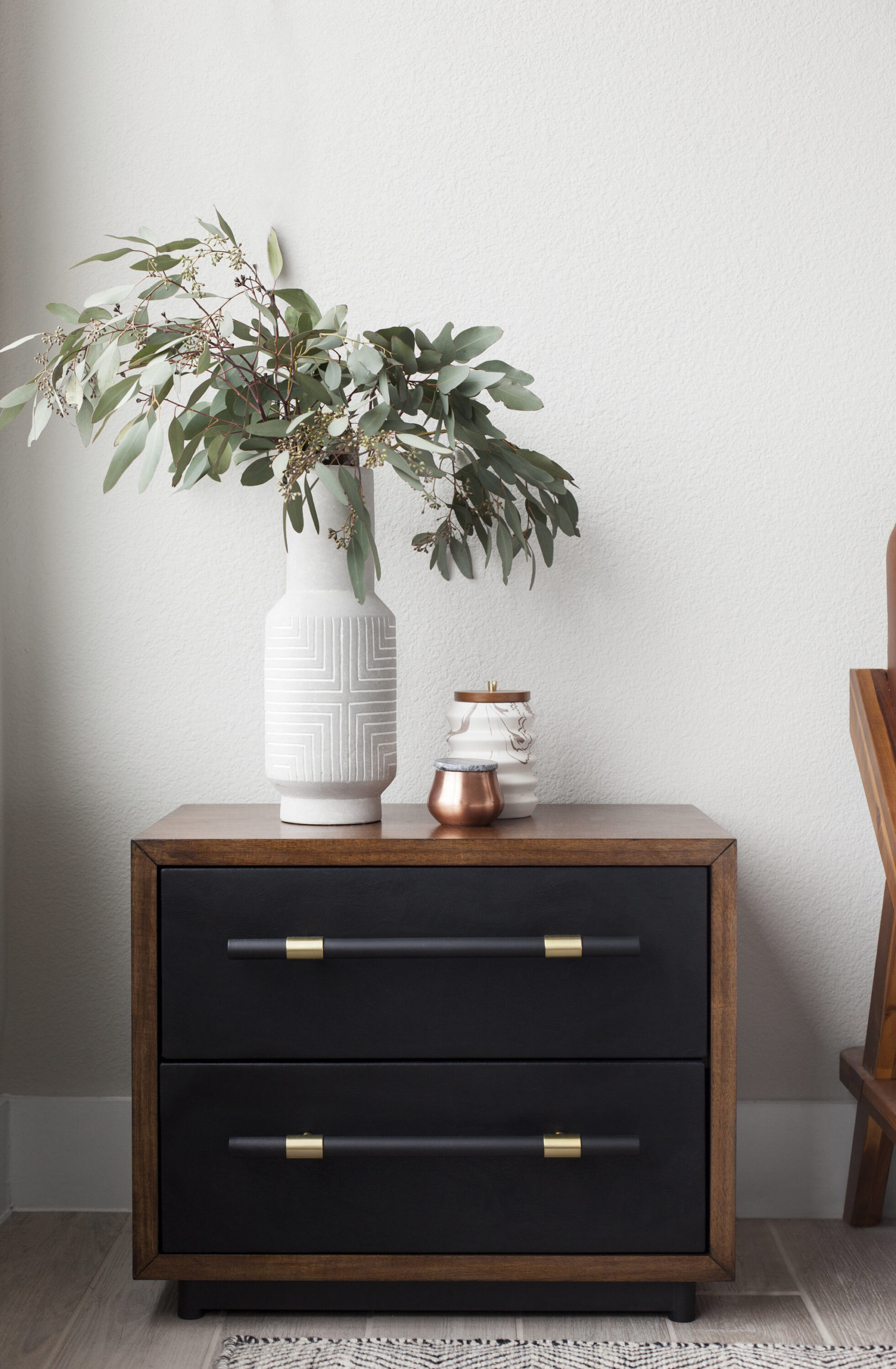
Nightstands // Vase (similar) // Candle // Marble Canister (similar)
It’s a little hard to tell from these images, but these nightstand drawer fronts are covered in this beautiful black leather, which adds so much interest and warmth to the space. I love that they are low to match the profile of the bed, but still wide enough to fill the space (that’s the biggest nightstand mistake I see out there – when they are too small, they look like they don’t belong in the space, like they’re just a temporary piece that was handed down to you from some other room, you know?).
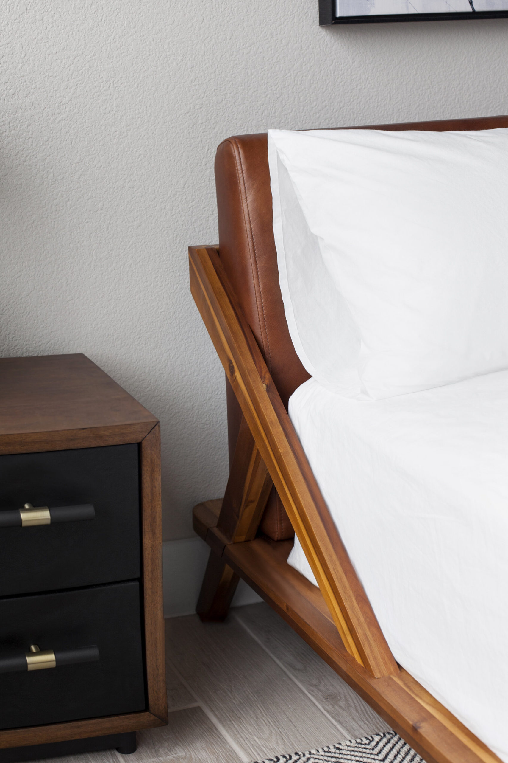
Bed // Bedding // Nightstand
This is kind of a random image, but I am so obsessed with the architecture of that bed and wanted y’all to be, too. That cognac leather headboard with the acacia frame gives the room (which would otherwise have been pretty monochromatic) that blast of warmth it needs.
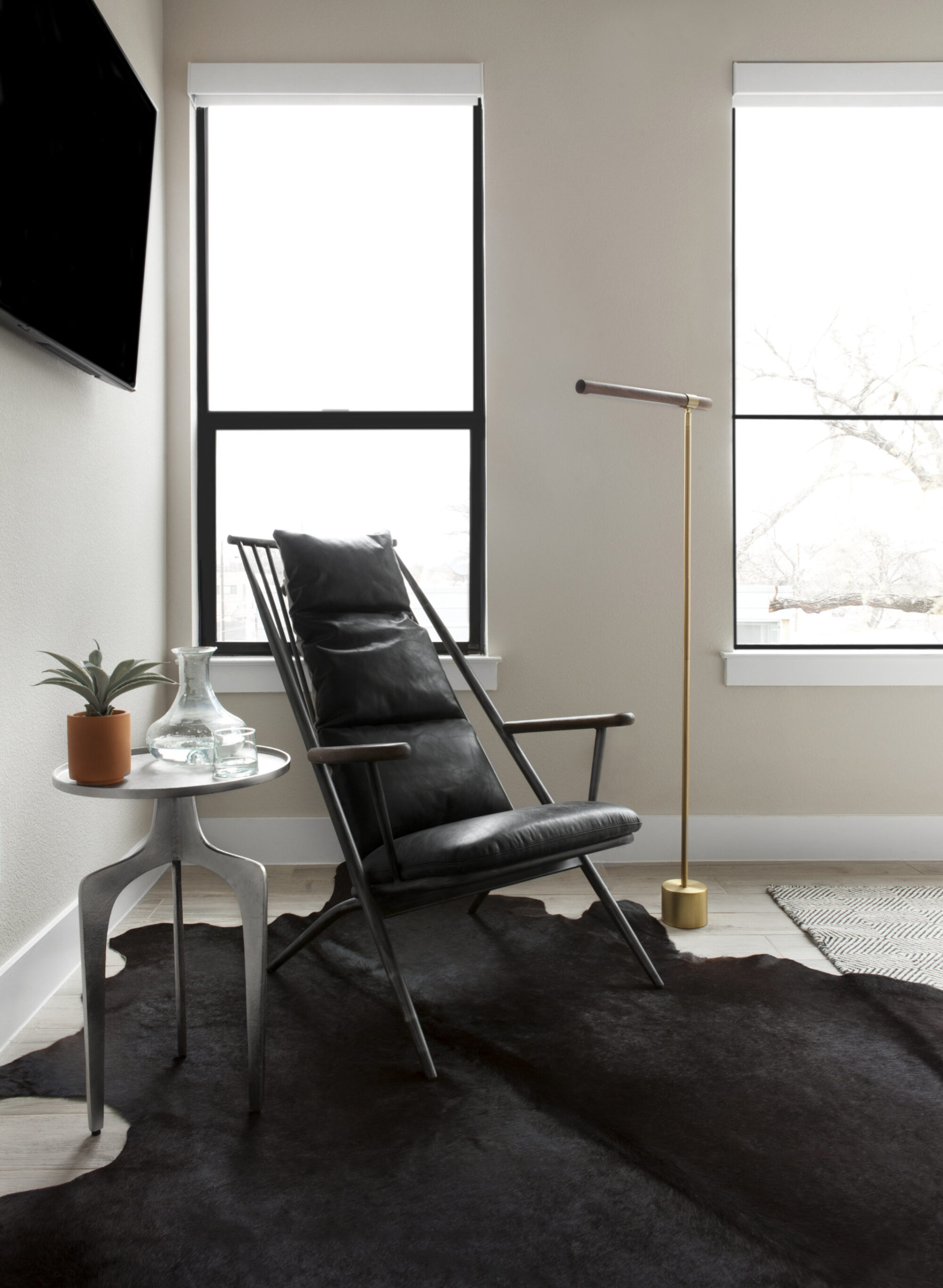
Chair (sold out, but this would be a great option) // Side Table // Lamp // Cowhide Rug // Faux Agave (similar) // Carafe + Glass (similar)
Sitting spaces have a real special place in my heart. I’m sure a major part of that is my (relatively extreme) introversion, combined with a love of reading. I’ve never created a space like this before, however, and I just love how it came out. It’s sexy, mildly sinister (I mean, if Tim Burton were an end table, right?), yet still inviting… I don’t know – I’m into it, though.
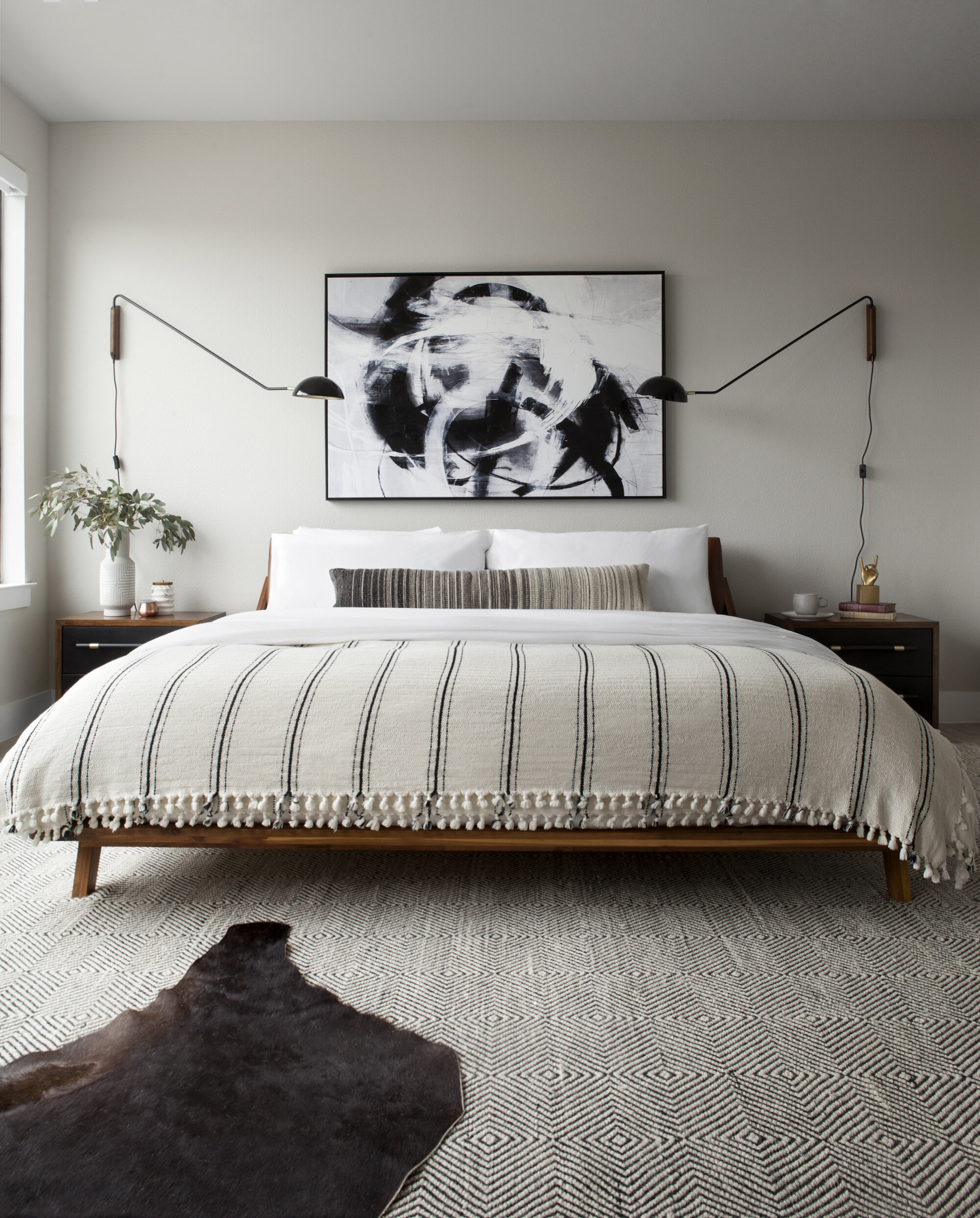
Bed // Bedding // Lumbar Pillow // Blanket // Area Rug // Cowhide Rug // Nightstands // Art // Wall Lamps
So there you have it, folks – the Deere Project master bedroom. I’m sad the reveals for this space are done, but I’m still so proud of this work, so you better believe I’ll be bringing it up from time to time. Also, this client is still one of my favorites, so if you need me I’ll just be trying to convince him to buy a fixer-upper so we can work together again OKAY?!
Post Script Blog Administrative stuff for those of you still reading: do we like link sources attached to each image? Or would you rather just get through the whole thing and find them listed once altogether? I’ve been doing them after each image because that’s what I prefer when I’m reading, but I was just curious what you guys thought. Let ya girl know.
xo,
sarah
I like them at each image but usually read to the end and then go back and click on the things I’d like to know the source of!
YES – that’s totally what I do, too! Thank you for the feedback!!
Each image, but I know that’s a lot of work! Will probably save you having to answer some questions though, the closer it is to the image. So I’d keep doing what you’re doing. I love this room. Somehow bold and serene at the same time!
It is more work, but who cares. I get mild anxiety when I’m reading through someone else’s post who has left sources until the end, thinking, "Yeah, but YOU’RE GONNA TELL ME WHERE THAT’S FROM, RIGHT?!" 😉
Beyond beautiful! Links under each image work. Can you share where the blanket source? I’m craving that exact one.
I am like you and prefer them with the pictures.
I love this room! What paint color is that on the wall?
Thanks, Alexis! I actually didn’t choose the paint color, so I’m not positive on what it is. I have a very strong hunch that it is Agreeable Gray by Sherwin Williams, though!