photos by Matti Gresham
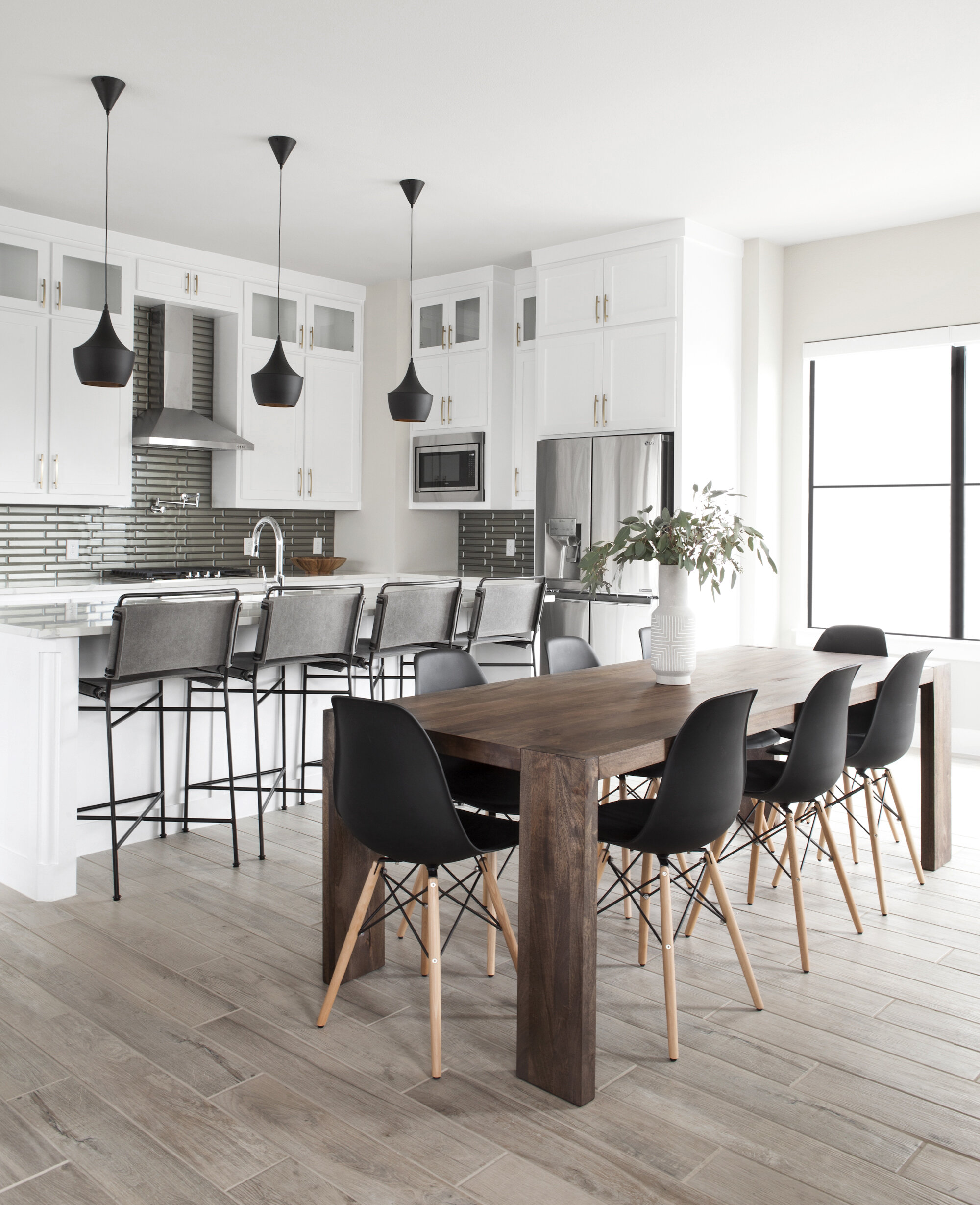
Y’all ready for Deere Project reveal number two?? I love this space. So so simple, yet still completely encompasses the vibe I was going for in this home. Minimal, masculine, mid-century.
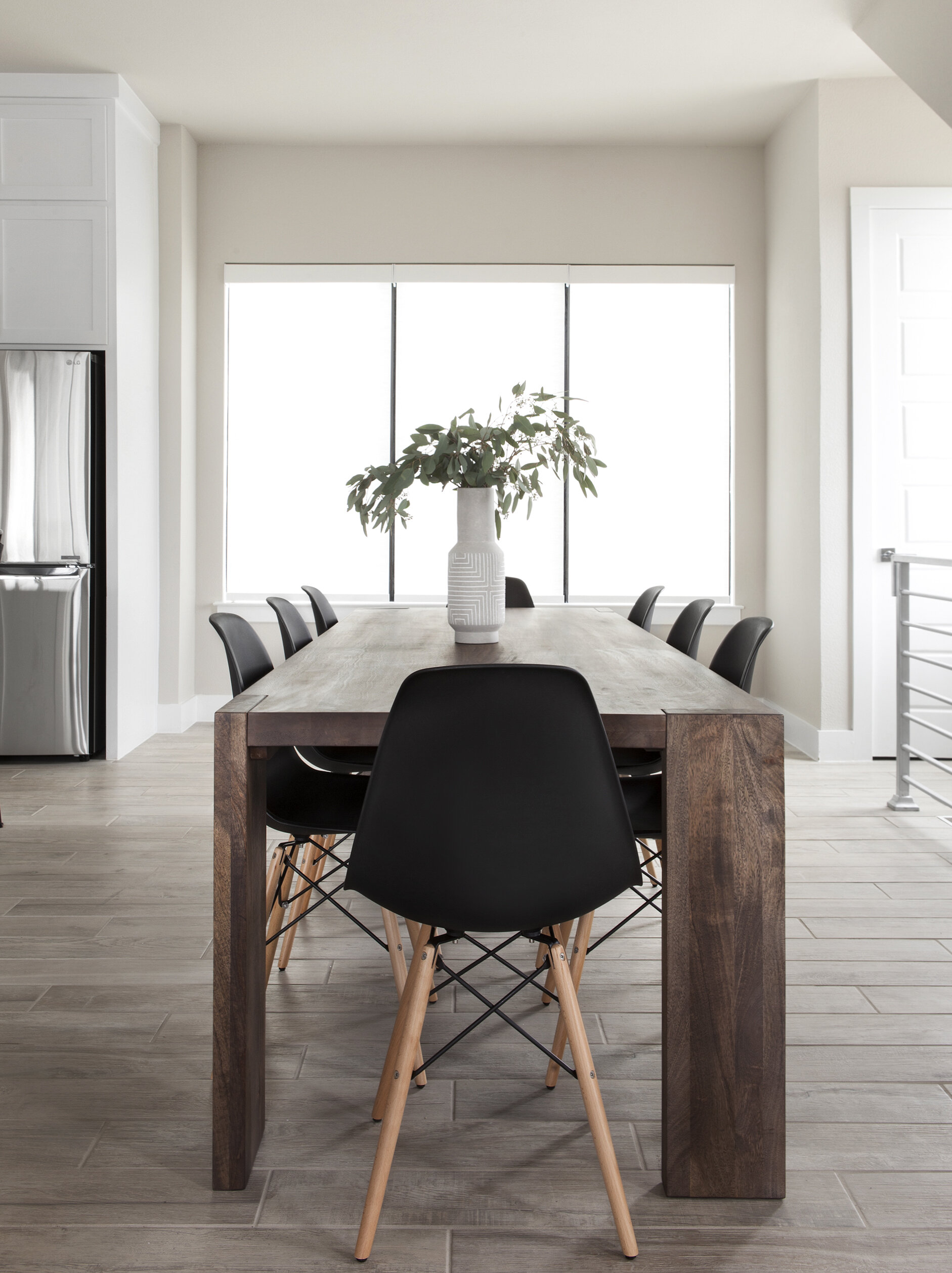
Table // Chairs // Vase (similar)
This table is one of my FAVORITE pieces (in this home slash just ever). I’m such a sucker for pieces that take a modern twist on a classic design. Speaking of classic, the chairs. I’m hard-pressed to find a situation/style/room in which they DON’T work (plus you can’t beat the price).
I was so incredibly pumped that the homeowner went for these barstools. I had admired them from afar for a while, so I was very eager to use them in a design. Bar stools are one of those things where I feel like I see the same four to five designs in every home I see. You know? You do, you know the ones. And it’s fine! But I wanted to do something different here (mental note: make barstool round-up for you guys).
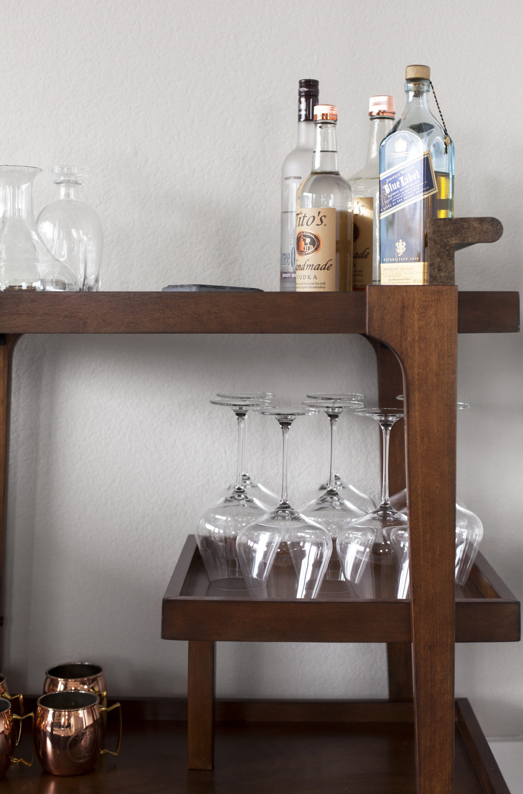
I was about to type something like, “What’s a bachelor pad without a bar cart?” But honestly, they belong in every home. Even if you don’t drink, they are such a fun storage piece to have (display your Topo Chicos, art supplies, or vintage pottery collection on them!).
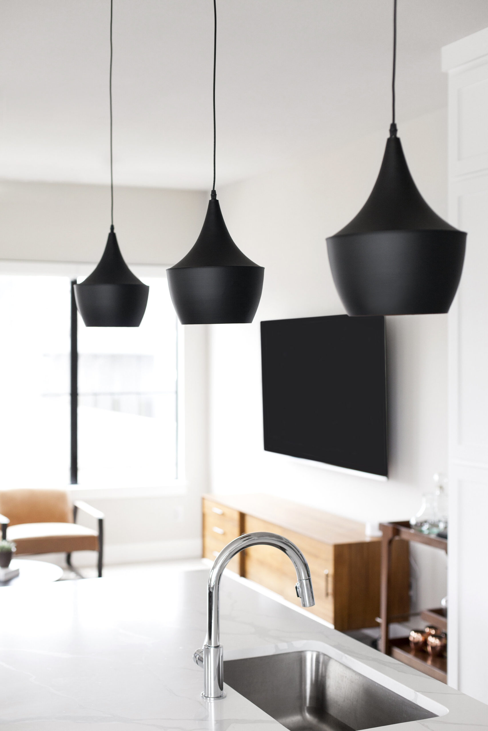
Pendant lights (similar); these would have also been rad
Let’s talk lighting for a moment. This is one of the easiest, most cost-effective ways to make a major impact in a room. This home came with pendant lights over the island that were…fine. But basic. Majorly basic. So we swapped them out for these bad boys which completely transformed the room.
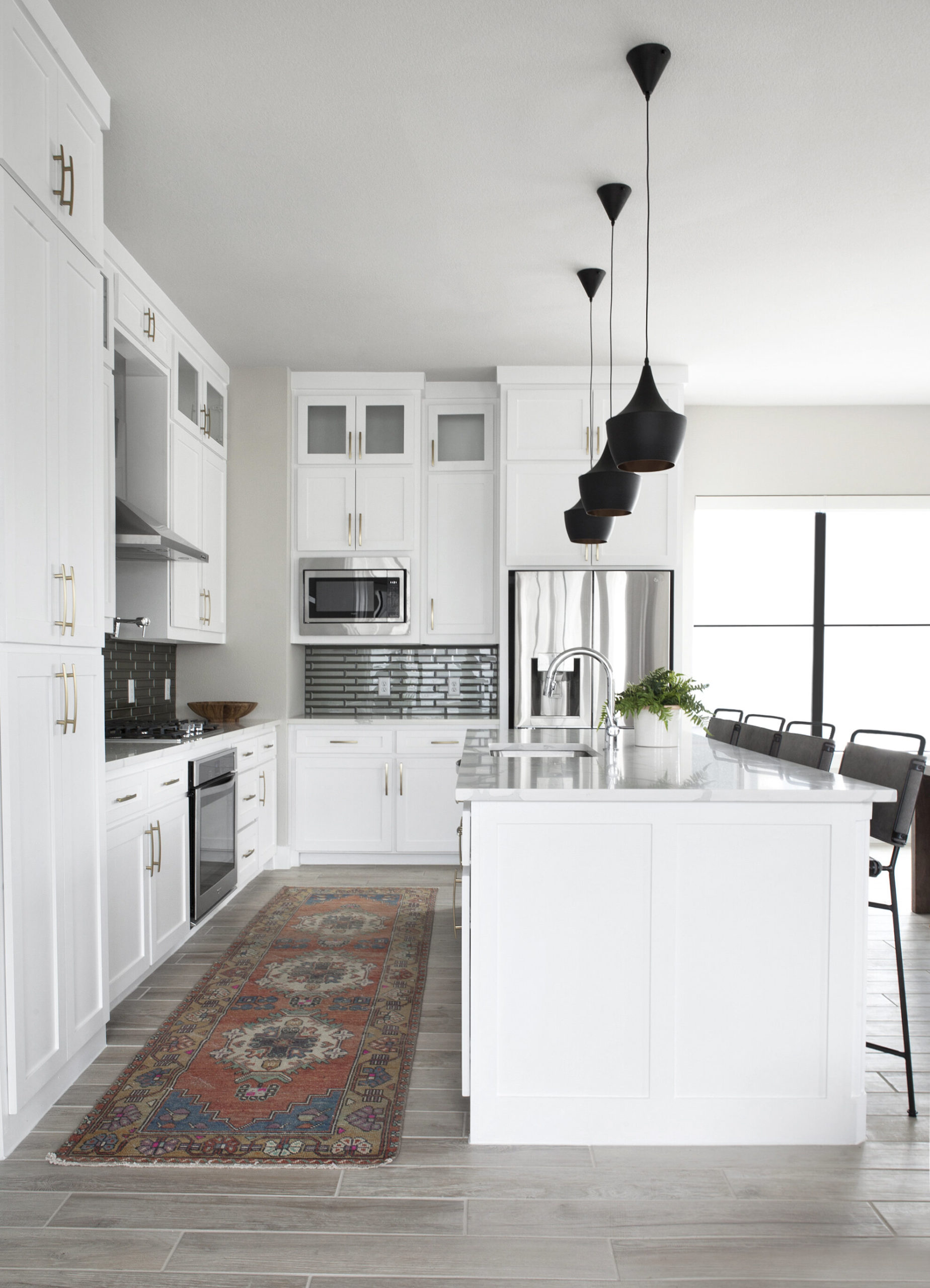
Rug (vintage, but same vendor here; similar look for less here) // Pendant Lights // Fern // Wooden Pedestal Serving Bowl (similar)
And finally, the rug. Oh, the rug. I am very, intensely, forever in favor of vintage runners in kitchens. It is always. always. always a good idea. The homeowner wasn’t so sure, at first, but texted me soon after install and said that it was probably one of his favorite parts of the design.
Okay. The end. How do we feel? Any sources I missed, or questions you have? Drop a comment! Also, don’t forget to be following along on Pinterest and LikeToKnow.it for more sources.
Note to self: get better at ending blog posts.
xo,
sarah
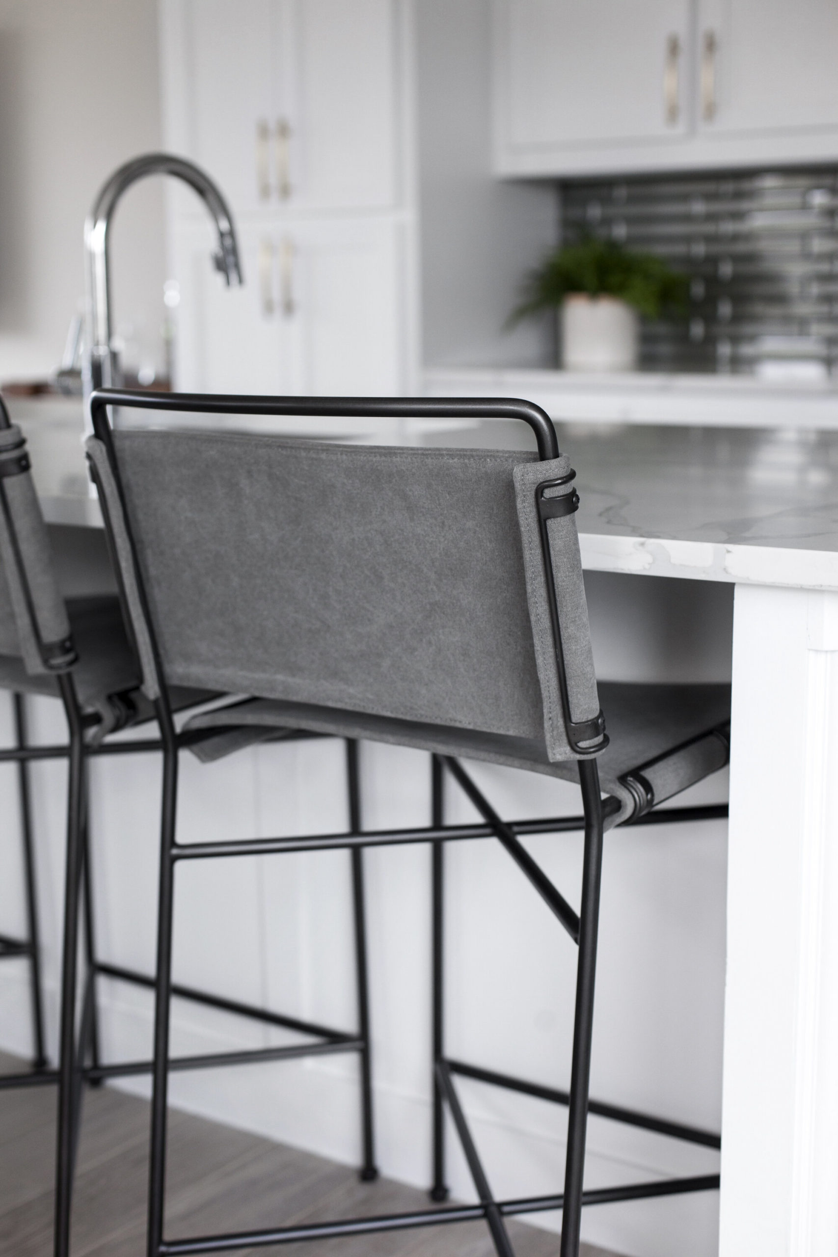
Interested to know more about the wall color, the back splash tile and the cabinet hardware! It’s all beautiful. I love how everything looks like it was just made to go in that room without being "matchy"
Thanks, Sara! I was actually just brought in to furnish and style this home. BUT, I can take a guess at paint colors and finishes the builder chose. I think the cabinetry is Chantilly Lace by Benjamin Moore, while the wall color is Agreeable Gray by Sherwin Williams.
I honestly don’t love the hardware in here, and would have chosen these instead: https://rstyle.me/+0bQ0NUKE_2OwdL6o5weh5Q
The backsplash is a glass subway tile that gives the illusion of being faceted. This one is super similar: https://rstyle.me/+clGuVDPKMS_5zV5nhDJFDQ
Hope this helps!!