
Hi, friends. Welcome to Part 3 of our home tour (be sure to check out the kitchen and dining/entry reveals if you happened to miss them!).
Other than the playroom, I think I daydreamed about this part of the house more than any other while we were still in our first home. I had visions of natural light, high ceilings, and access to the kitchen + other areas of the house (all things our former home lacked) running in my head constantly.
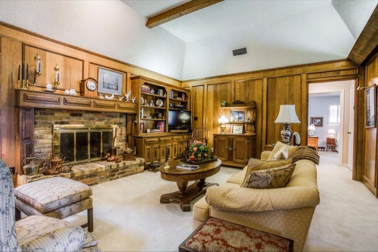
BEFORE
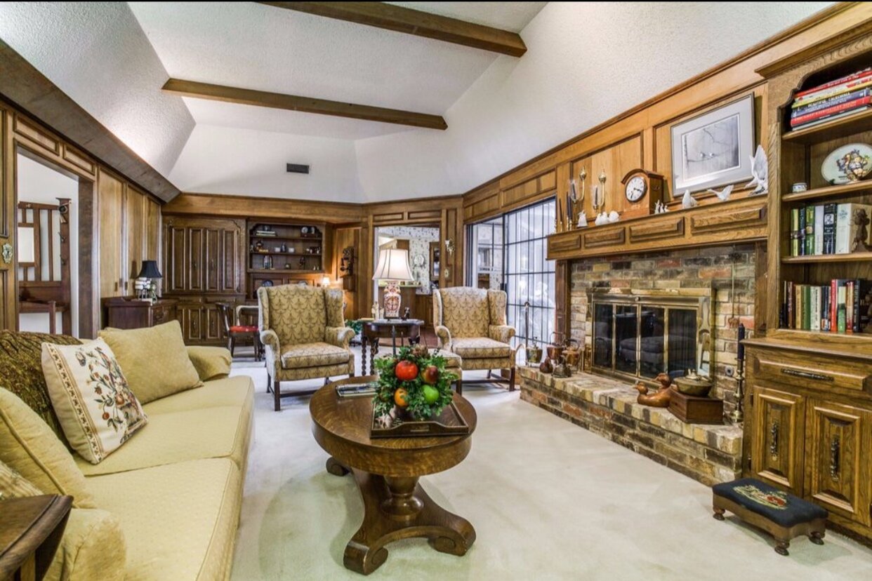
BEFORE
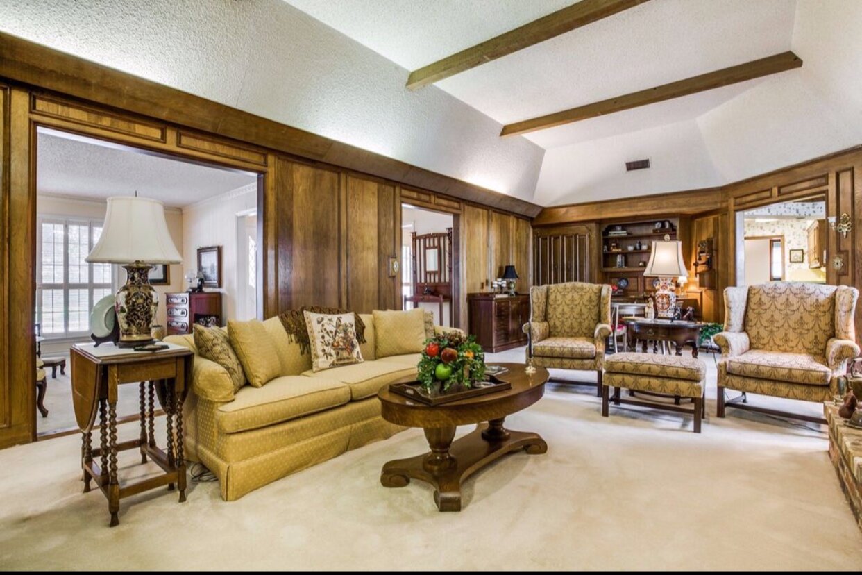
BEFORE
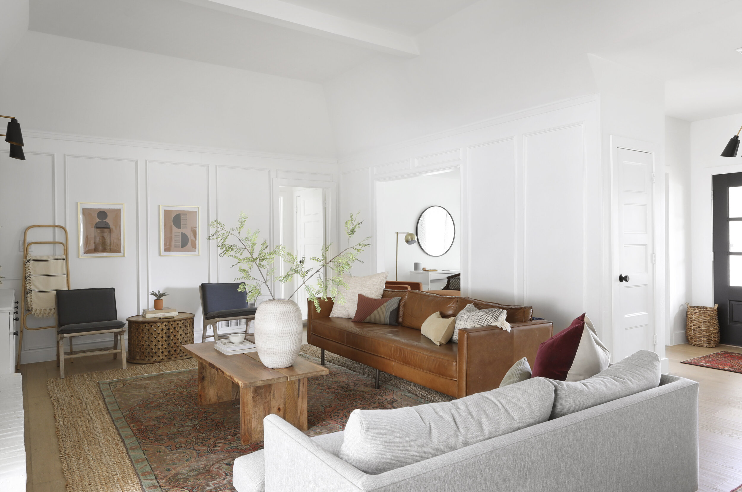
Just for reference, let me give you a layout from the above photo’s perspective. The first opening from right is where our office is (the former homeowners used this as a sitting room…like, to sit). The next opening over is from the entry (you can see a sneak peek of the front door from the office, as well as the entrance to the dining room from the entryway). Then the opening on the left leads you to the breakfast nook and kitchen.
Leather Sofa // Loveseat // Coffee Table // Vase (unavailable, but I like this one even better) // Top Rug (vintage, but similar here) // Jute Rug // Dining Sources // Kitchen Sources
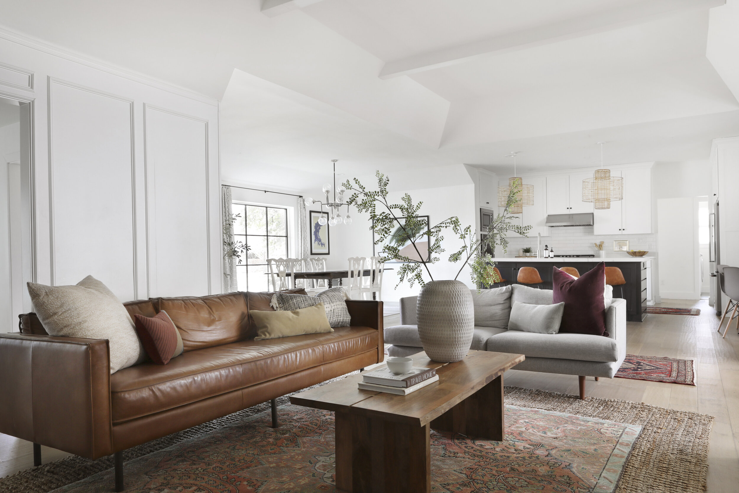
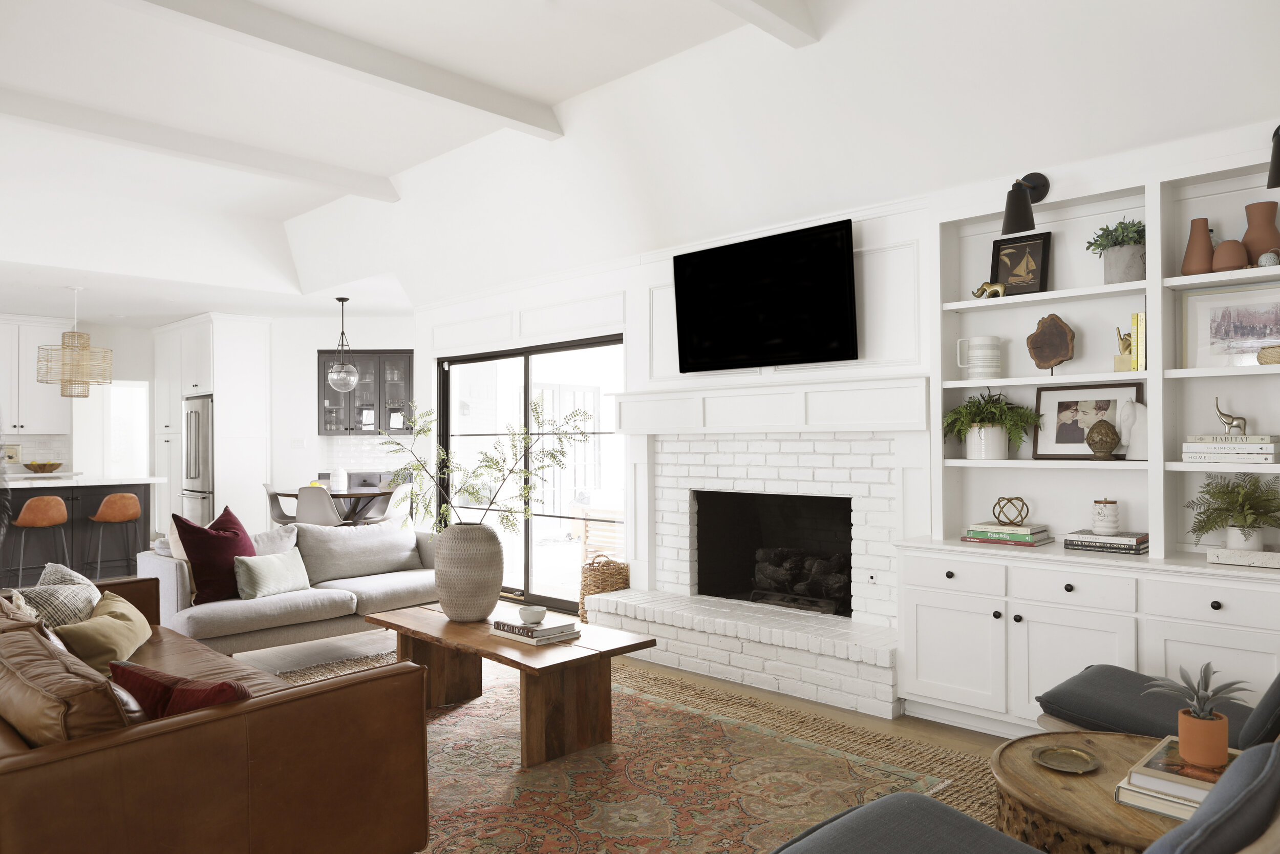
Obviously, the biggest change from this perspective is the view. We removed the walls separating the dining, kitchen, and breakfast nook. Because of this, we re-centered and replaced the beams. I don’t mind contrasting dark beams against a white ceiling, but for our home I wanted it to feel as tall as possible, so I basically wanted the beams to disappear.
Leather Sofa // Loveseat // Coffee Table // Vase (similar) // Faux Stems // Accent Chairs (color no longer available, so similar blue chairs here) // Round Accent Table // Block Print Art (here and here) // Blanket // Ladder (similar)
White paint is the hero of this story. We went with Benjamin Moore’s Chantilly Lace on the walls, trim, ceiling – everything, really. It’s hands down my favorite white paint if you want a true white – it never pulls any yellow or blue.
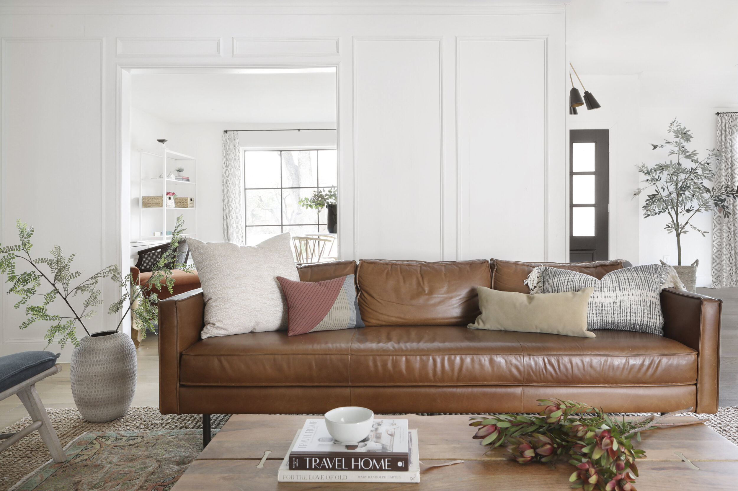
Leather Sofa // White Pillow // Colorblock Pillow // Suede Lumbar // Fringed Pillow (similar) // Coffee Table
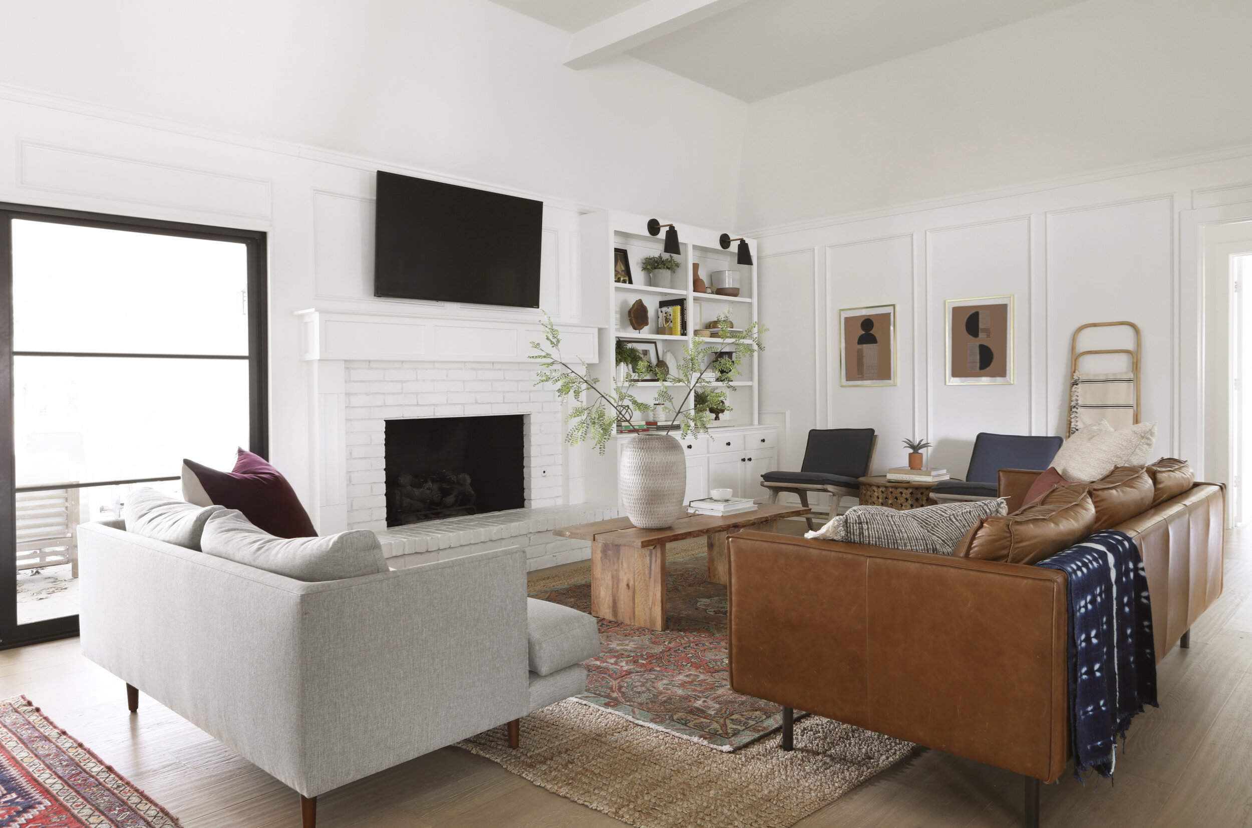
I firmly believe that leather is one of the most kid-friendly upholstery options out there. Yes, the finish ages and changes as time goes on, but I happen to love that.
You can catch a peek of my office back there. I can’t wait to give y’all the full reveal of that space.
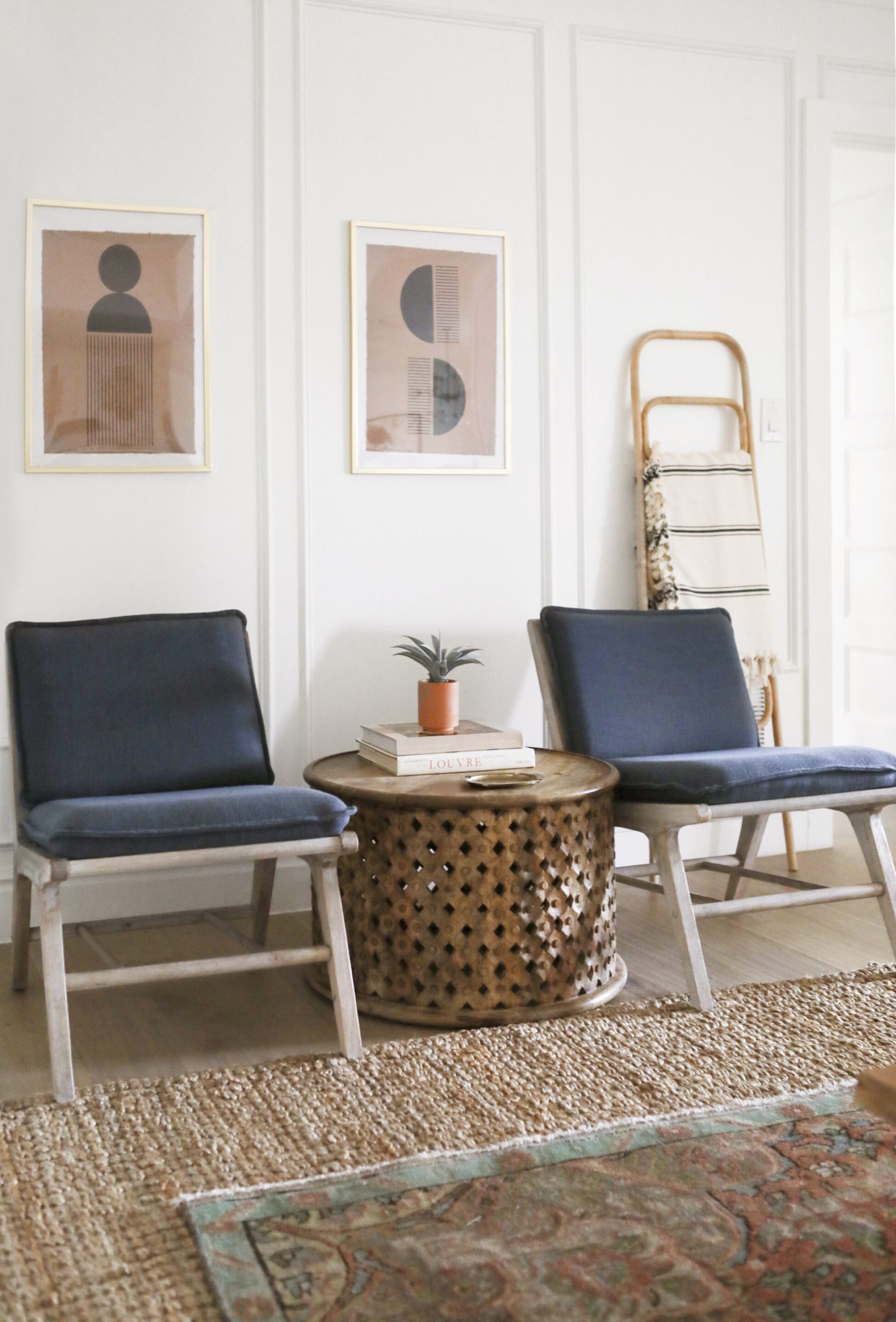
Block Prints (here and here) // Chairs (similar) // Accent Table // Blanket // Ladder (similar) // Jute Rug // Vintage Rug (similar option here)
Let’s talk rug-layering for a bit, shall we? I’ve shared my love for this little “trick” on Instagram before (see my Design Tips highlight), but it’s definitely worth repeating. The main thing you are able to achieve with this is that you get to pull in the color, comfort, and history of a vintage rug without the huge cost. Most living spaces need a 9×12 floor covering (obviously every space is unique and sometimes you can get away with 8×10, but I’d bet money that nine times out of ten the bigger option would look better). The thing is, a vintage rug that size will cost you thousands of dollars. So what I like to do is bring in a 9×12 sisal or jute rug to fully cover the space, then a smaller vintage piece to layer on top (vintage rugs have such unique sizing, but somewhere between the 6-8×9-10 range will work).
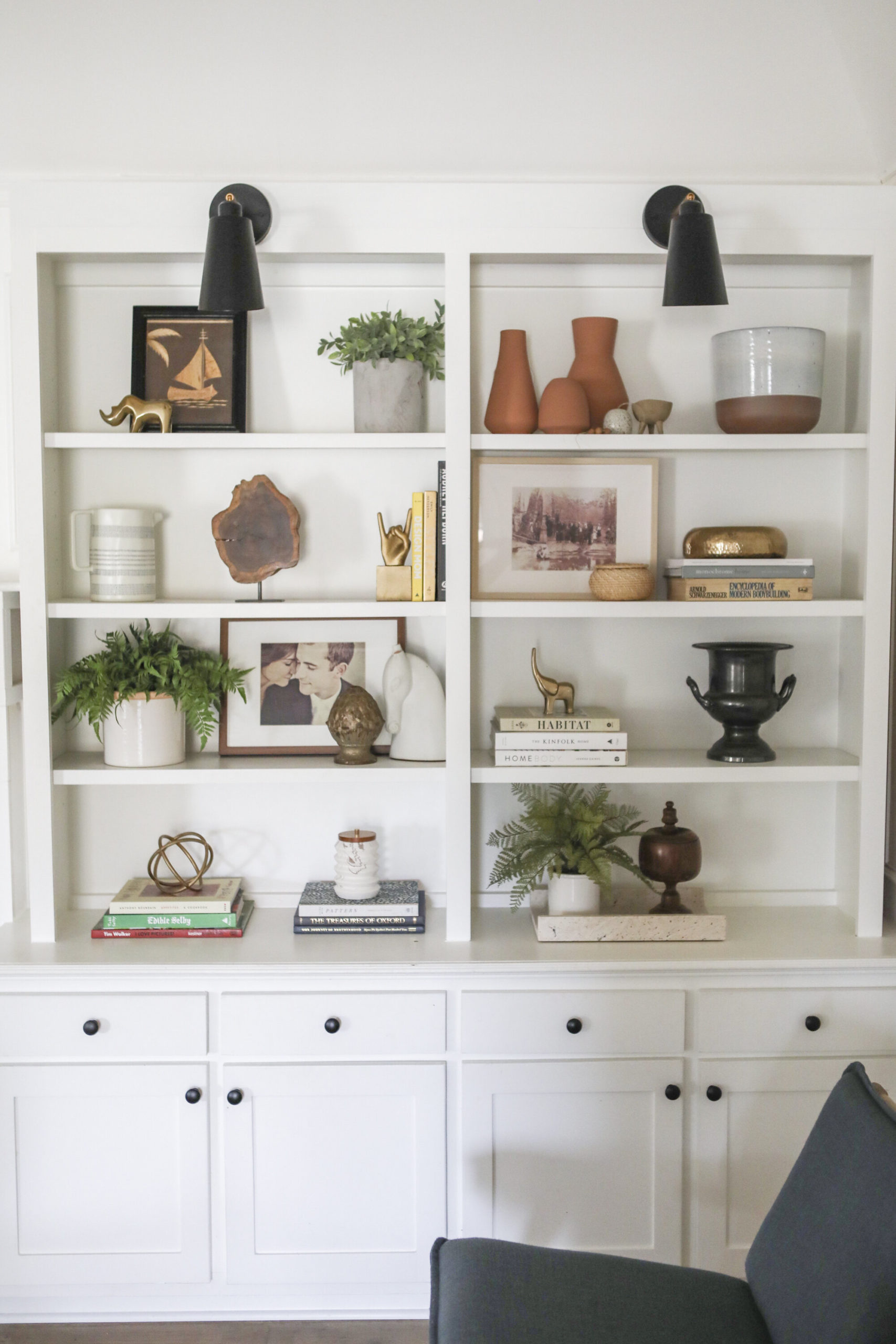
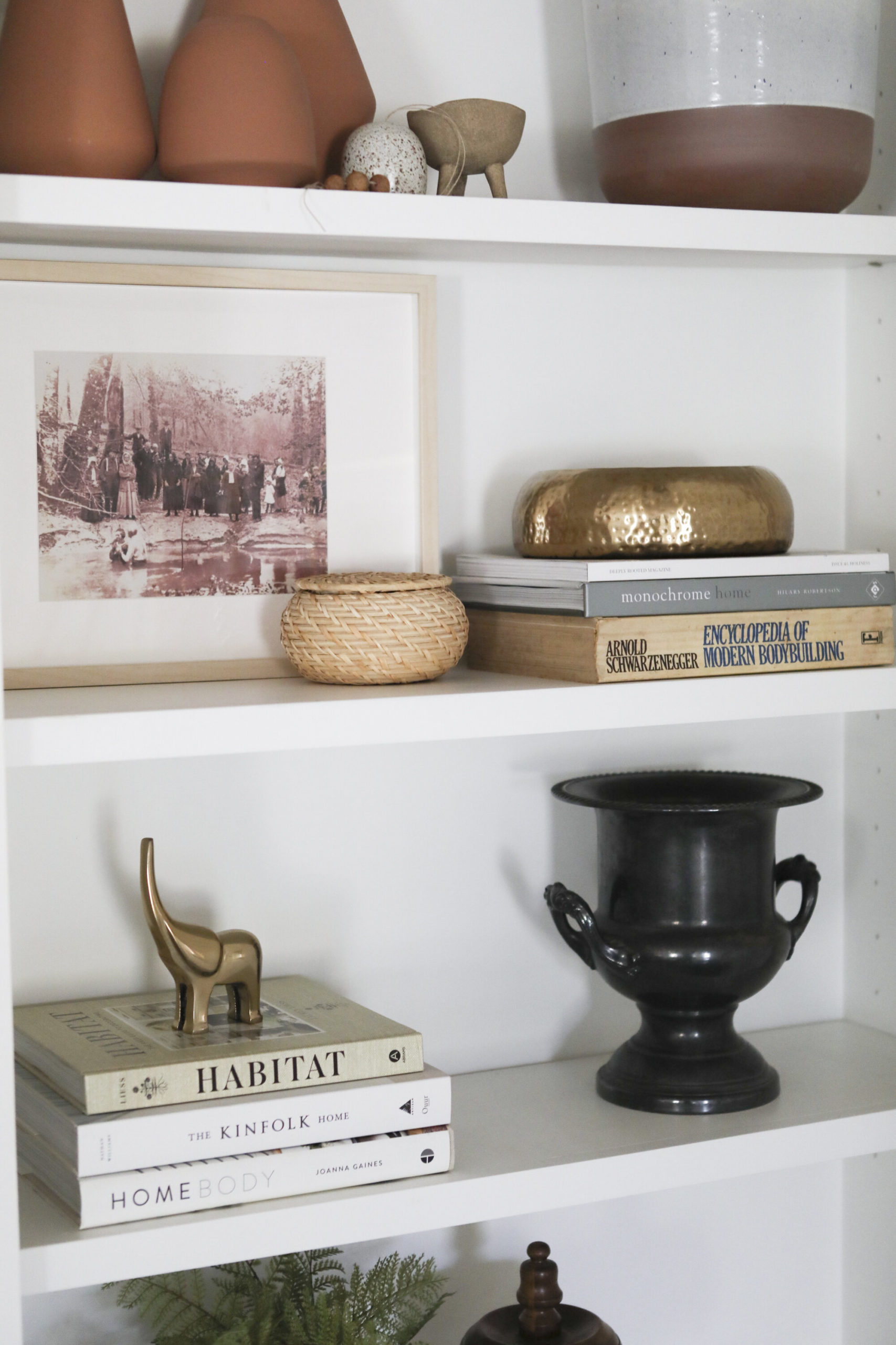
I was thrilled about these built-ins, they just needed a little facelift. We removed the scalloped edges from the top, took them a tad higher, added sconces, and replaced the drawer fronts and doors to match the shaker cabinets of the kitchen.
Most of the pieces in the shelves are vintage, but this shop on Amazon is my go-to for decorative accents.
Loveseat // Velvet Pillow // Lumbar // Leather Sofa // Coffee Table // Vase (similar) // Kitchen Sources
We had the mantle removed and replaced with more shaker millwork to bring the space up to date. Another one of my favorite changes we made to the house was replacing the slider to the back patio (it was actually an enclosed sunroom originally – more about that transformation another day). I love how sharp the black doors look against the white in the rest of the room.
Loveseat// Leather Sofa // Shibori Textile // Coffee Table// Runner (vintage, but similar here) // Wall Sconces
Additional sources:
Builder: Axiom Builders
Wall Color: Chantilly Lace by Benjamin Moore
Doors and Windows: Pella
“After” Photography: Matti Gresham
There she is, friends. Our movie den, board game headquarters, indoor obstacle course (the rugs are lava, obviously) – this room serves so many functions for our family, and we love it so. There was A LOT to source from these photos, so if I missed something, let me know and I’ll link it if I’m able.
Stay tuned – I’ll be back soon with a tour of our laundry room and guest bathroom.
xo,
sarah


read or leave a comment