
Our house is shaped kind of like a horseshoe. You walk into the center of it, and open before you is the kitchen and dining to the left, family room and office to the right, but it’s essentially all one big space. Then off of these areas are two hallways that take you to other parts of the house (a row of bedrooms on one; the guest room, guest bath, laundry, and playroom off the other).
Both of the rooms we’re going through today were, in the beginning, going to be left basically as-is. We weren’t sure how far our budget would stretch, and they were…fine. They worked, even if they were sad to look at. But, as often happens in renovations, little changes ended up being necessary. The floors, for instance, had to be replaced in each room because of the wood flooring we were putting into the hall. We were already painting the whole house, so why not paint in these rooms, too? Throw in a couple of super generous surprises from our contractor, and we’re left with two vast improvements.
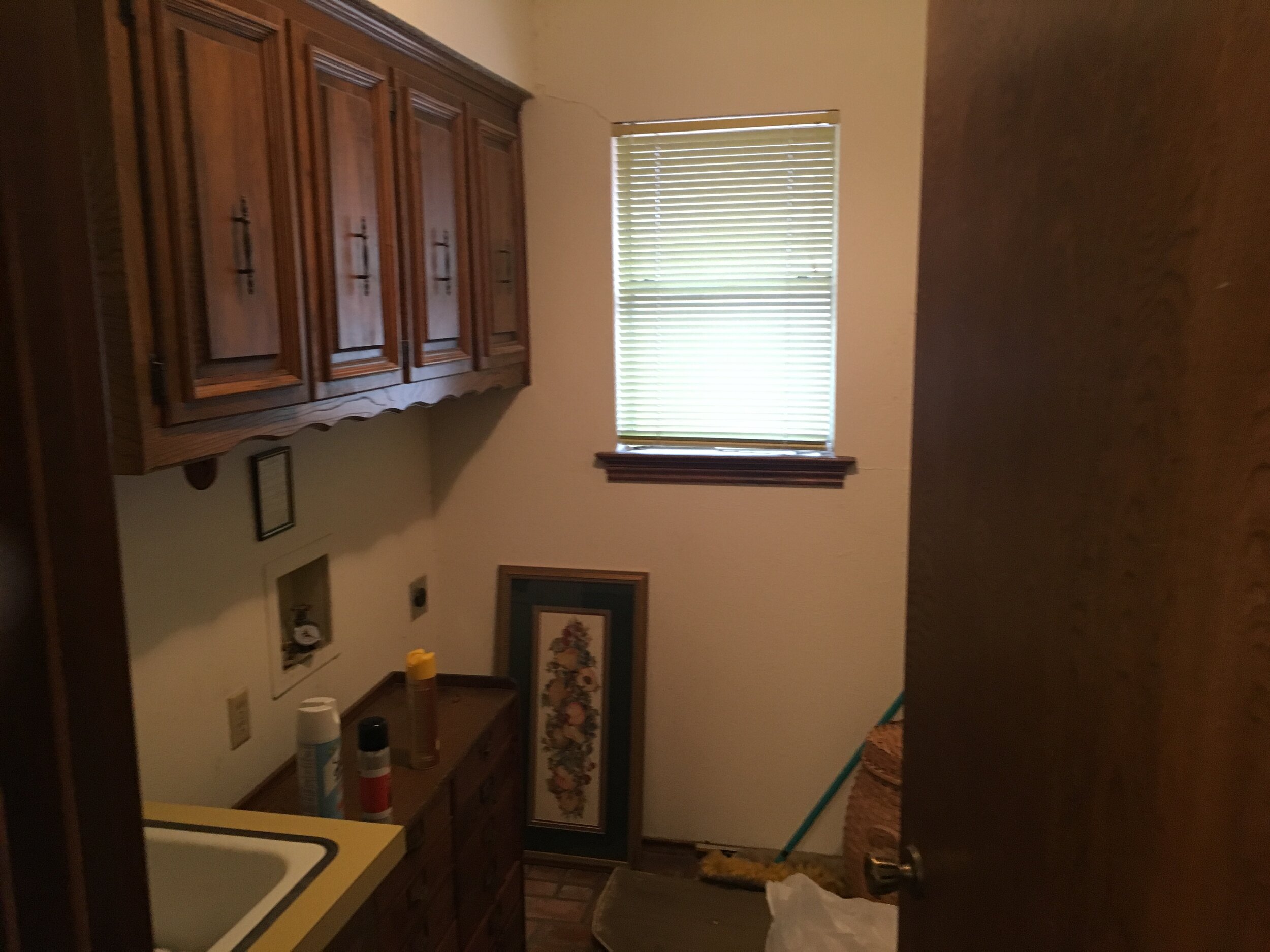
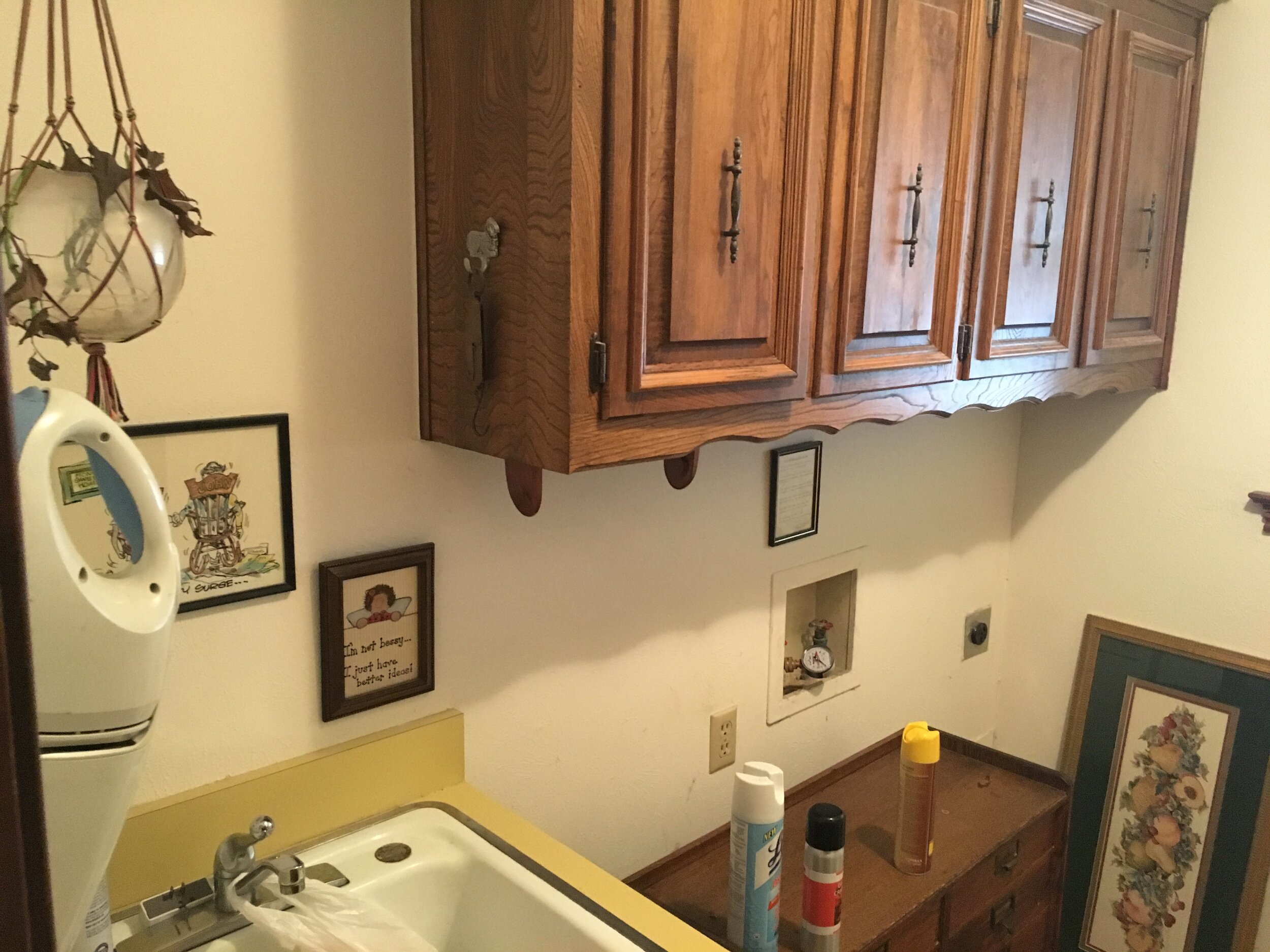
BEFORE
BEFORE
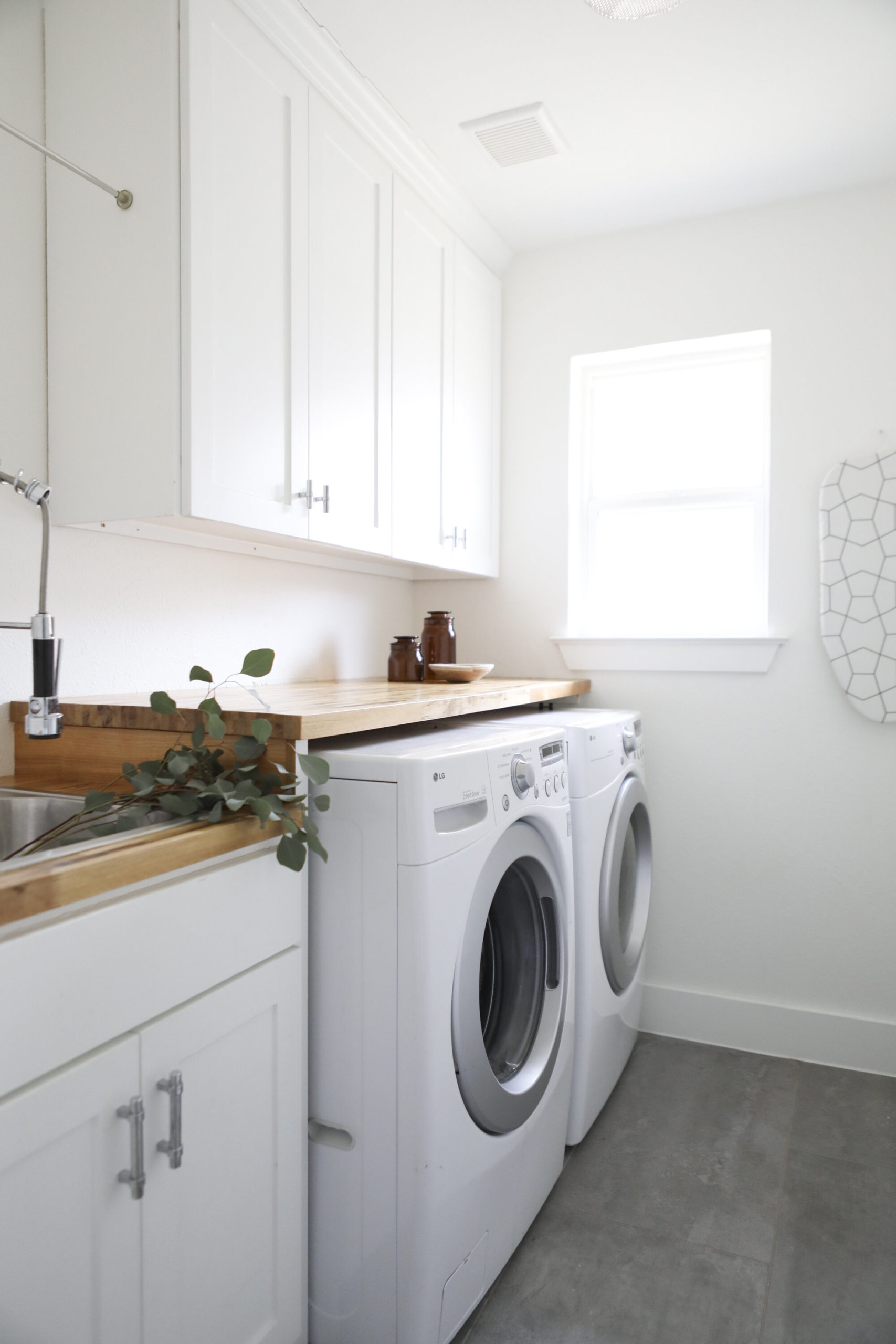
Floor Tile // Cabinet Pulls // Cabinet Knobs // Faucet // Amber Canisters // Woven Basket (similar) // Ironing Board
We were going for a soft yet utilitarian minimalism in here, and I think we nailed it. I wanted the floor to look as much like poured concrete as possible, and the tiles we used in here definitely do the trick. We added a butcher block counter above the appliances and around the sink. We weren’t going to replace the cabinets (just because I figured I could make do), but I came in one day during renovation and our contractor had made the executive decision to bring in new shakers (he said, “I mean, I couldn’t let you leave those old ones in there…”). I was so happy I think I may have cried.
We also replaced the window in here, which made a huge difference. We splurged on the wood clad windows in the front of the house, then saved with vinyl throughout the rest of the house (all from Pella).
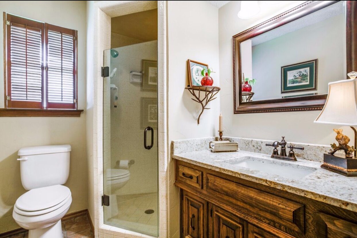
Like I mentioned before, we’d originally planned on just leaving this room alone. Then we had to replace the tile. Then, since they were already painting, we chose a yummy sage green color for the vanity…
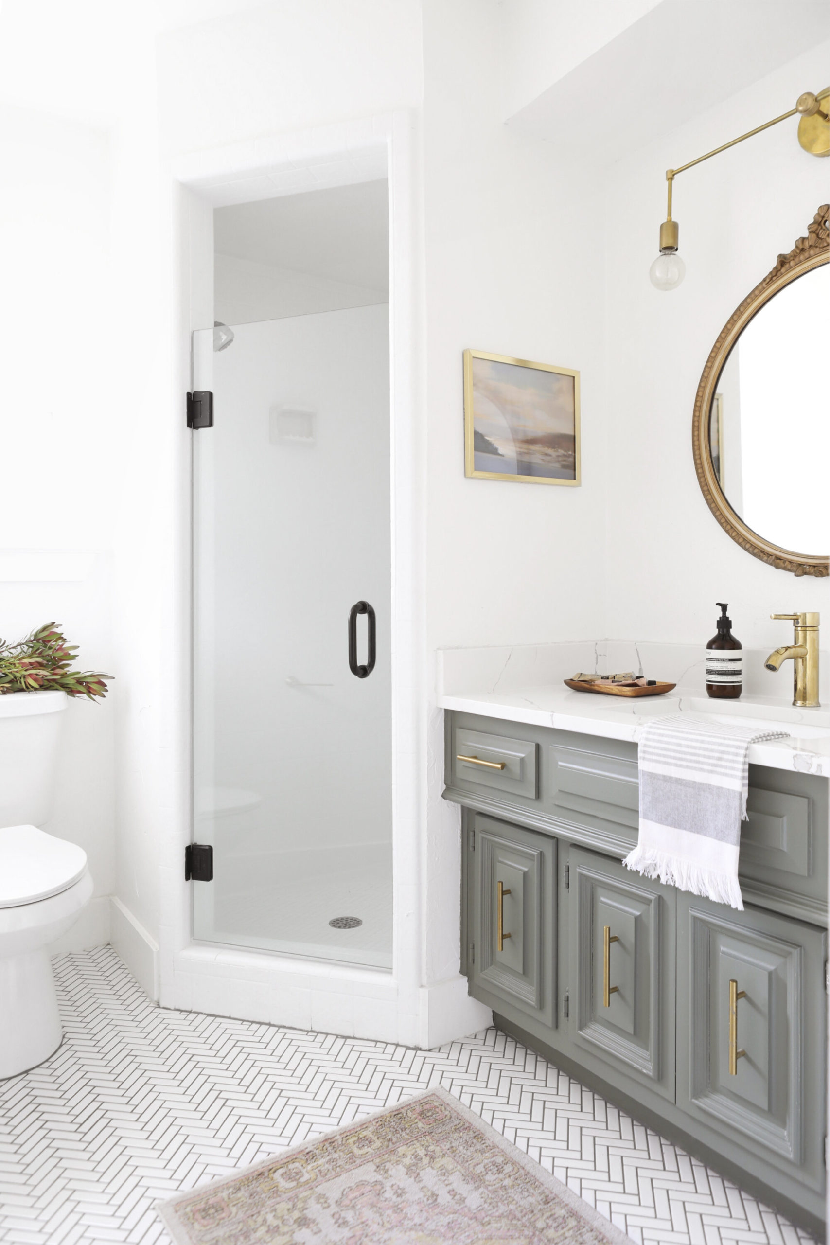
Floor Tile // Rug (similar) // Cabinet Hardware // Toilet // Faucet // Hand Towel // Hand Soap // Mirror (mine is vintage, but this one is similar) // Art (similar) // Wall Sconce
Then, we realized that we could paint the tile and make it look 1000x better (it’s hard to tell from this photo, but it could best be described as looking like popcorn jelly beans). Then the toilet was replaced (another surprise from our contractor)…
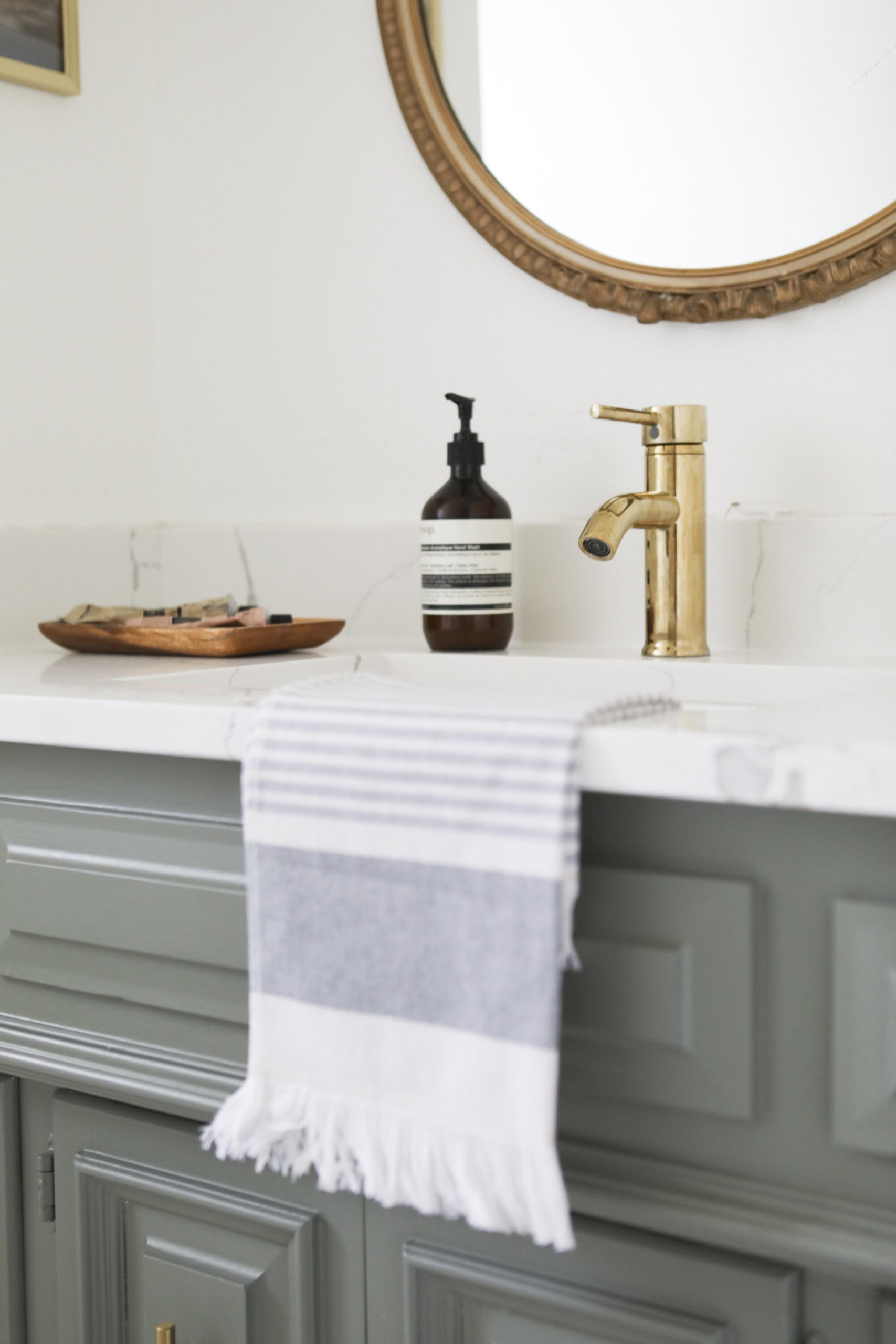
THEN, we realized that we had a bit of our kitchen counter top left over from that project, so we would only have to pay the cost of fabrication to swap it out. I was able to select a simple single-hole faucet (and inexpensive – you need to see the price on that bad boy) since we were re-fabricating.
I wouldn’t call that all “mission creep”, but rather taking advantage of simple opportunities for improvement.
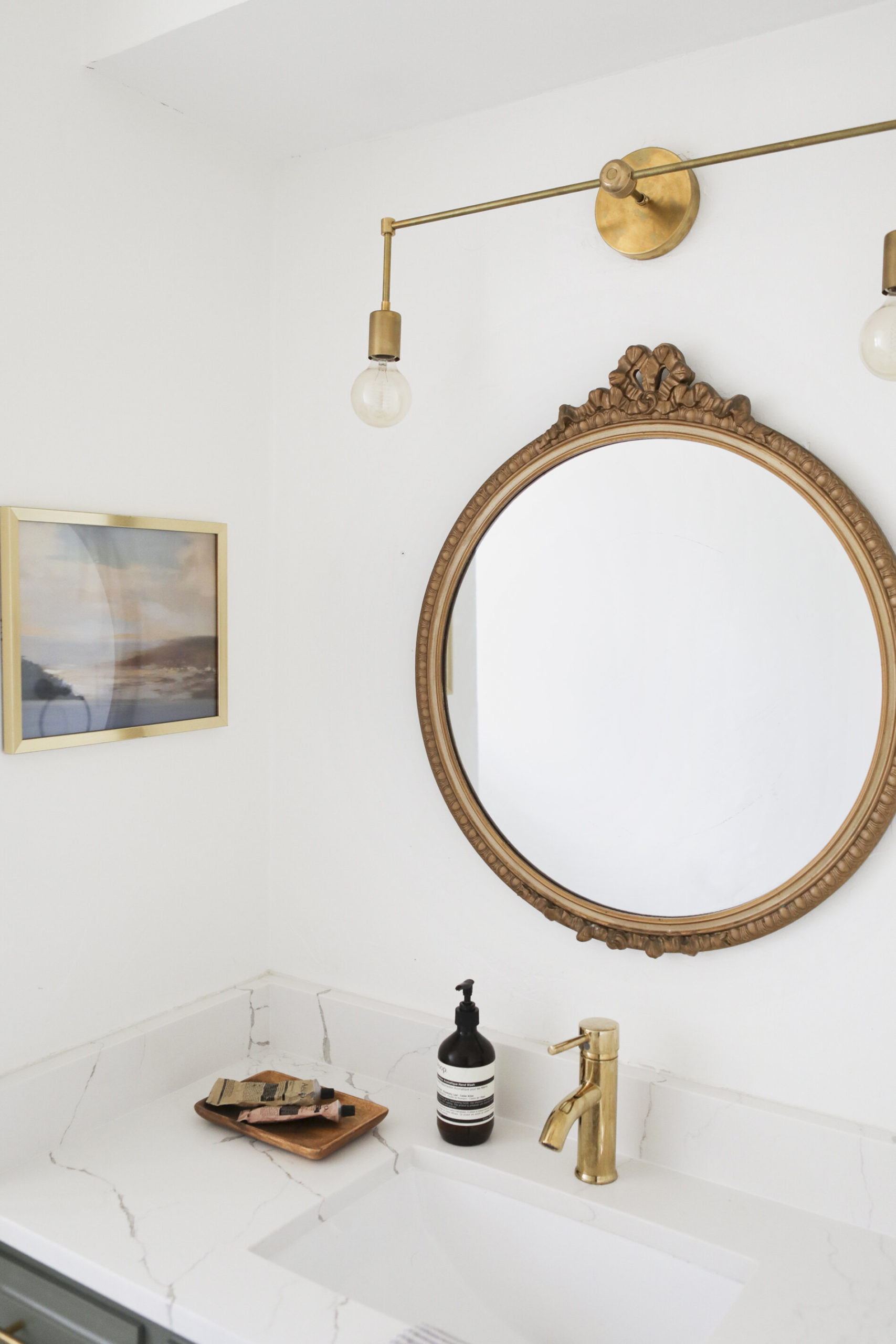
The art in here looks vintage, but is actually a printable piece from this shop in Etsy (my new favorite cost-effective art trick). And fun fact: I borrowed the Aesop products from my fancy friend just to use as props for the shoot, which was a mistake because now I’m addicted.
So there she is. Have y’all noticed that every room is a “she” to me? Are houses like boats in that way? These are the things I think about.
xo,
sarah
Additional sources:
- Contractor: Axiom Builders
- Wall Color: Chantilly Lace by Benjamin Moore
- Vanity Color: Pigeon by Farrow & Ball (but honestly, it was mixed wrong at Sherwin Williams; in reality, that color is much much lighter).
- After Photography: Matti Gresham


read or leave a comment