Y’all. It’s the LAST room of the tour of our home here on the blog! It has been SO so fun for me to go back and see where this house of ours began, and how far it has come. It’s brought back fun memories from the renovation, and more than anything has made me so incredibly grateful for this home, and the opportunity to improve it.
Our bathroom was another one of those rooms where it really just made sense to level the whole thing and start over (much like the kitchen). You can see in the “before” photos, the bathroom included a vanity (that was technically in our bedroom), a tiny shower, a dated and sunken bathtub, and an exposed toilet.
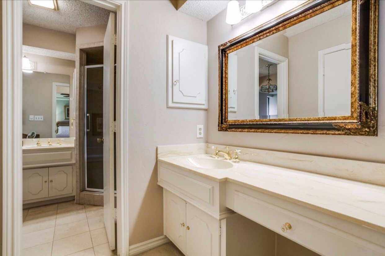
BEFORE
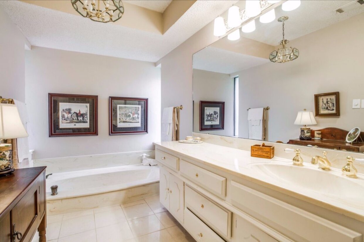
BEFORE
Working with our contractor, we were able to check all of the boxes we were looking for in this space, namely a double vanity, large shower, freestanding tub, and water closet (aka small toilet room). We wanted a fresh, clean, minimal space – I really love how it turned out.
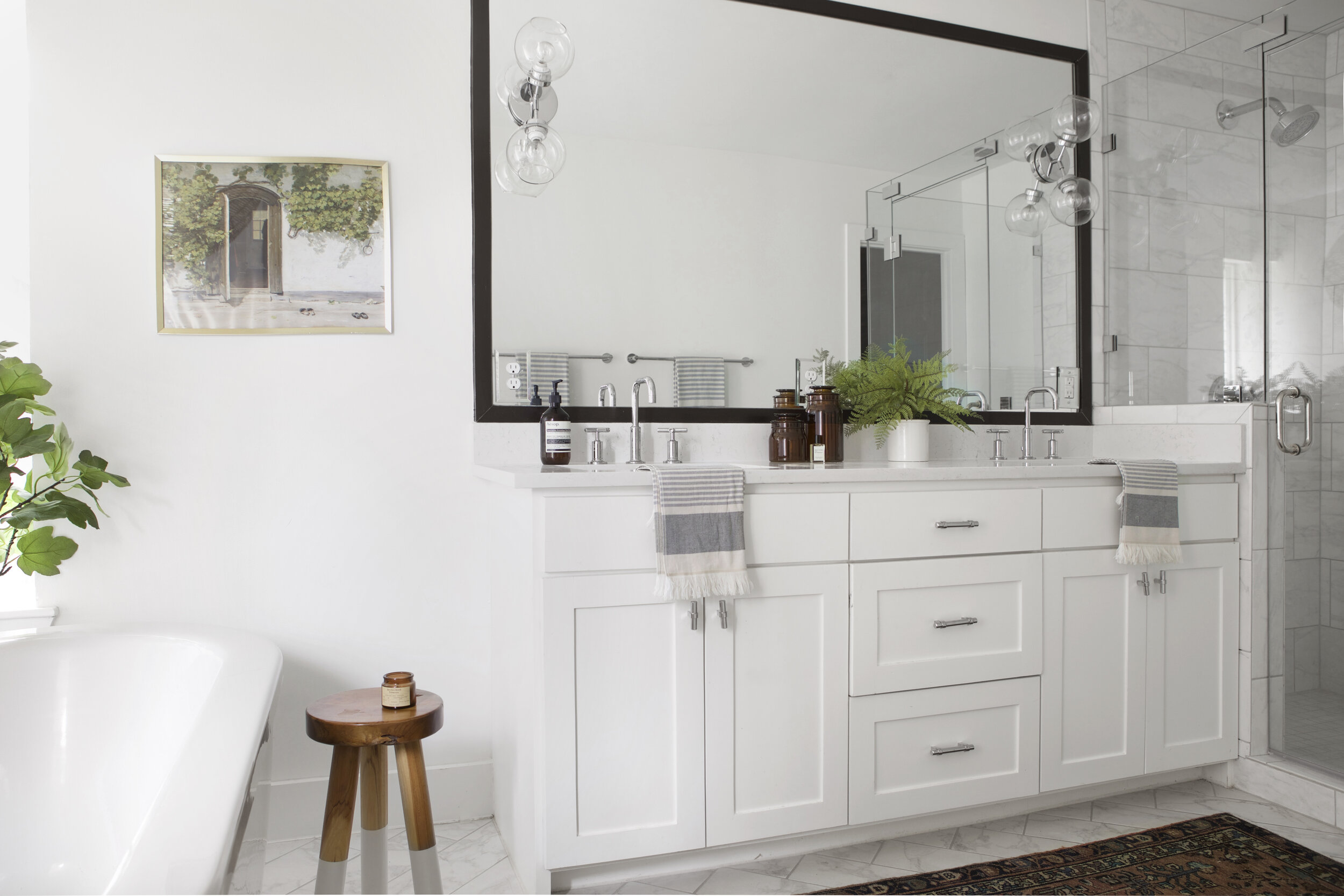
Tub // Stool // Faucets // Door Hardware // Drawer Hardware // Hand Towels // Rug (vintage, but similar vintage here) // Amber Glass Canisters // Floor Tile // Wall Sconces // Print (similar)
Durability was a key factor in how we designed our bathroom. We went with porcelain tile with a marble print, as well as quartz for the counter tops – both products that give the look of that gorgeous stone, without the high-maintenance care required to keep it up.
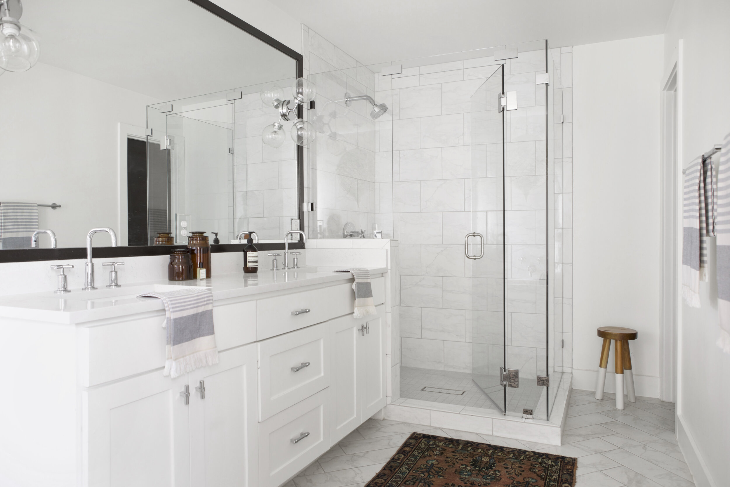
Stool // Faucets // Door Hardware // Drawer Hardware // Hand Towels // Bath Towels // Towel Bars // Rug (vintage, but similar vintage here) // Amber Glass Canisters // Floor Tile // Wall Tile // Wall Sconces // Shower Fixture
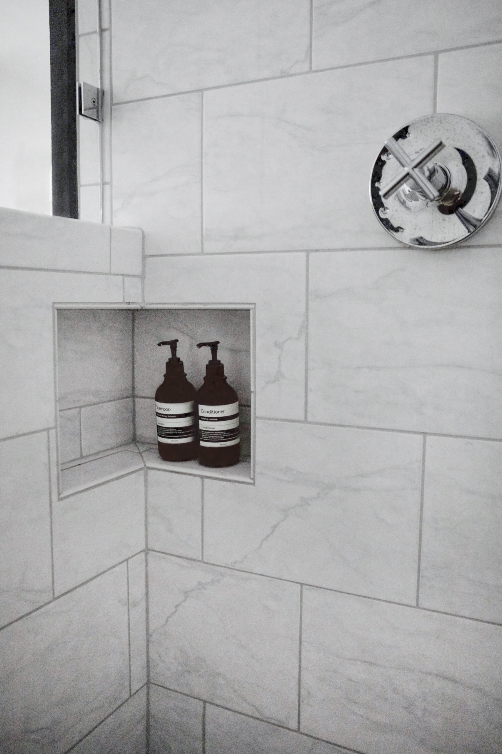
I wanted a shower niche, but not necessarily one that can be seen – hence the magic of this corner ponywall niche. This way we can store our shampoo and body wash without it needing to be on display. And bonus: this low niche is the perfect “foot stand” for shaving my legs. Two birds, people.
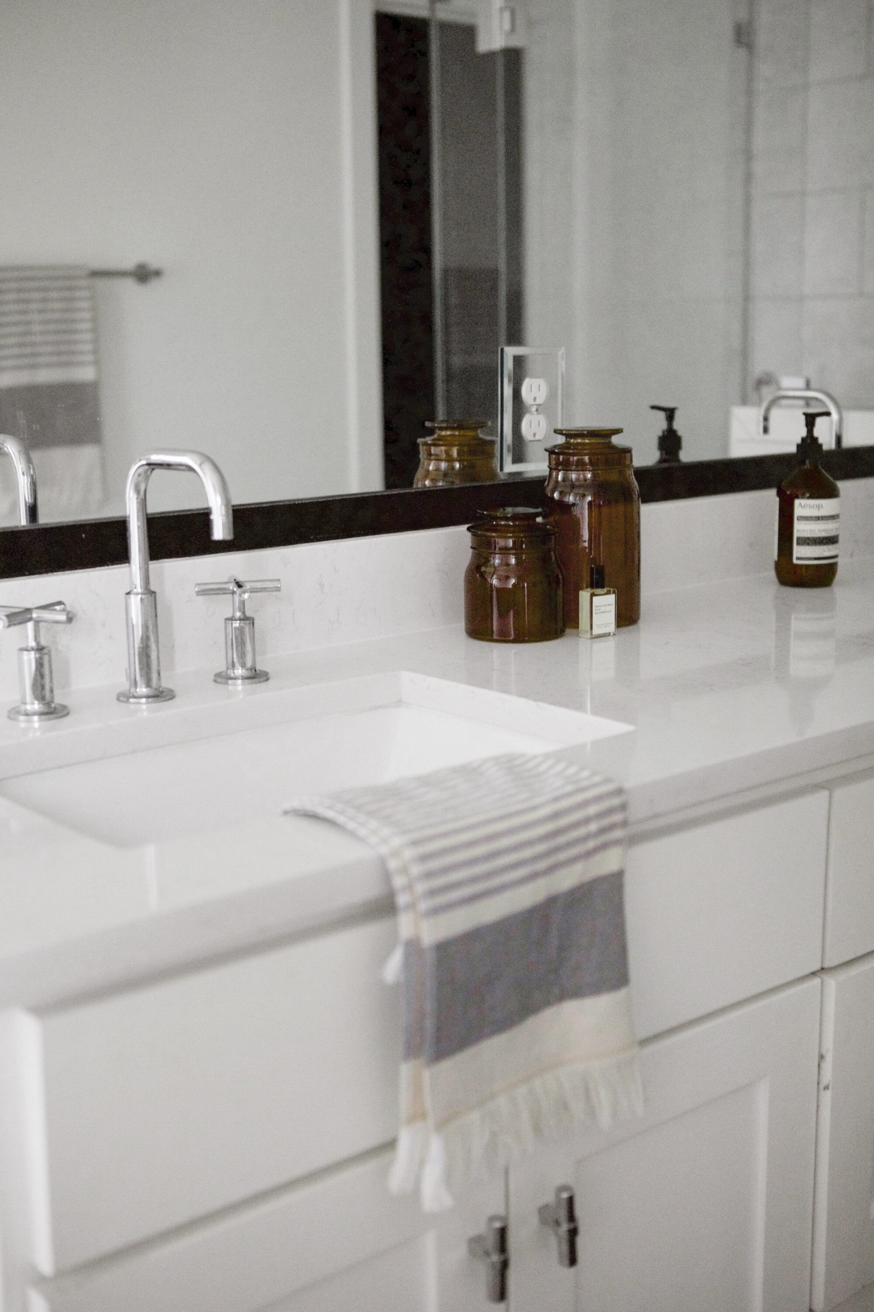
Hand Towel // Faucets // Cabinet Hardware // Amber Glass Canisters // Hand Soap
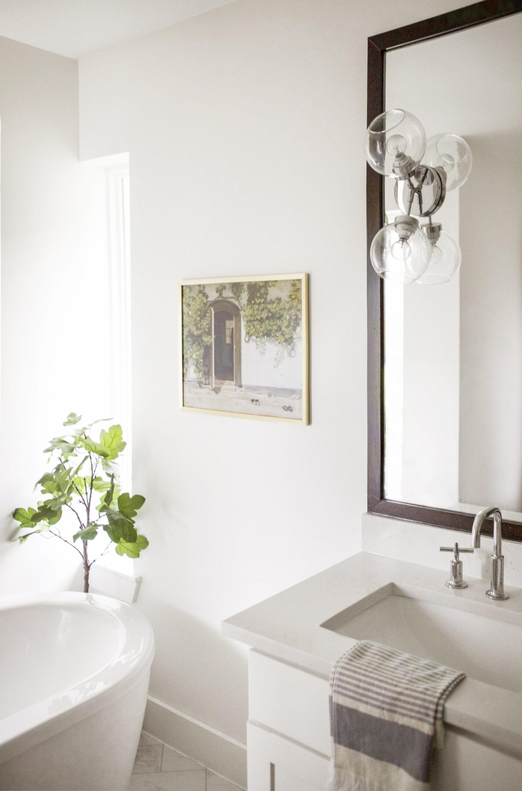
Tub // Faucet // Wall Sconce (similar) // Hand Towel // Print (similar) // Frame
Full disclosure: I do not enjoy those wall sconces. I had selected different ones, they didn’t work out, I picked these out at the eleventh hour (on maybe five minutes of sleep because Deacon was a newborn at this time). They absolutely work, but they definitely aren’t “me”, and definitely don’t pack much of a style punch. I’ve had my eye on these (customized in the “Pinto” color) as replacements, so now it’s just a matter of convincing David this needs to happen (wish me luck!).
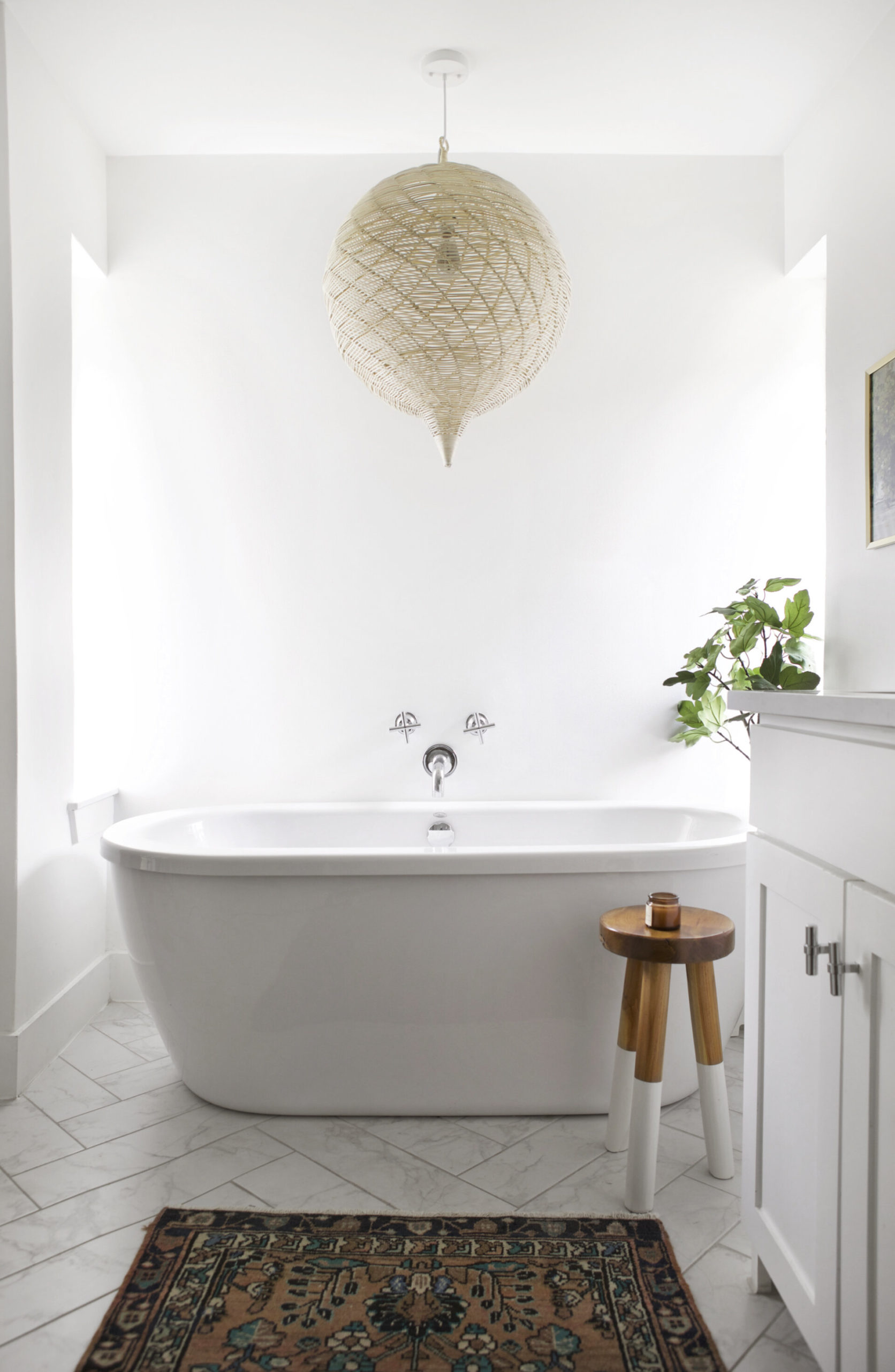
Pendant // Tub // Tub Faucet // Stool // Rug (vintage, but similar) // Floor Tile
This pendant light – sigh. I love it so dang much. It adds an earthiness and warmth that the room (which was leaning very monochromatic) really needed. The vintage rug helped with this, as well, as vintage rugs are consistent to do.
So there she is! While I think the next bathroom I design for David and I will take a few more risks, I know it will draw on the same neutral palette and minimalist design as our current one.
A few closing details:
Wall Color: Chantilly Lace by Benjamin Moore
Mirror Trim: Tricorn Black by Benjamin Moore
Contractor: Axiom Builders
After Photography: Matti Gresham
Did I leave anything out? Any questions? So very happy to help, if so!
xo,
sarah
What material is the wall behind the freestanding tub?
Love the faucets for the free standing tub!!!
I had them install my tub ‘backwards’ so the silver drain overflow doesn’t show because I have rubbed bronze faucets.