The Carriage Hills project wrapped over a year ago, but I still adore her (houses are girls, duh) and still receive multiple questions about these designs daily, so I figured it was time to give her a proper reveal.
My clients were the sweetest, coolest young family you ever did meet. They have three adorable little girls, love to host, and have killer style. They brought me on board to push the limits creatively, offer expertise on some of those mind-numbing details that come with a renovation, create a cohesive aesthetic throughout the house, and be the first point of contact for the general contractor.
Let’s start with the before of this room..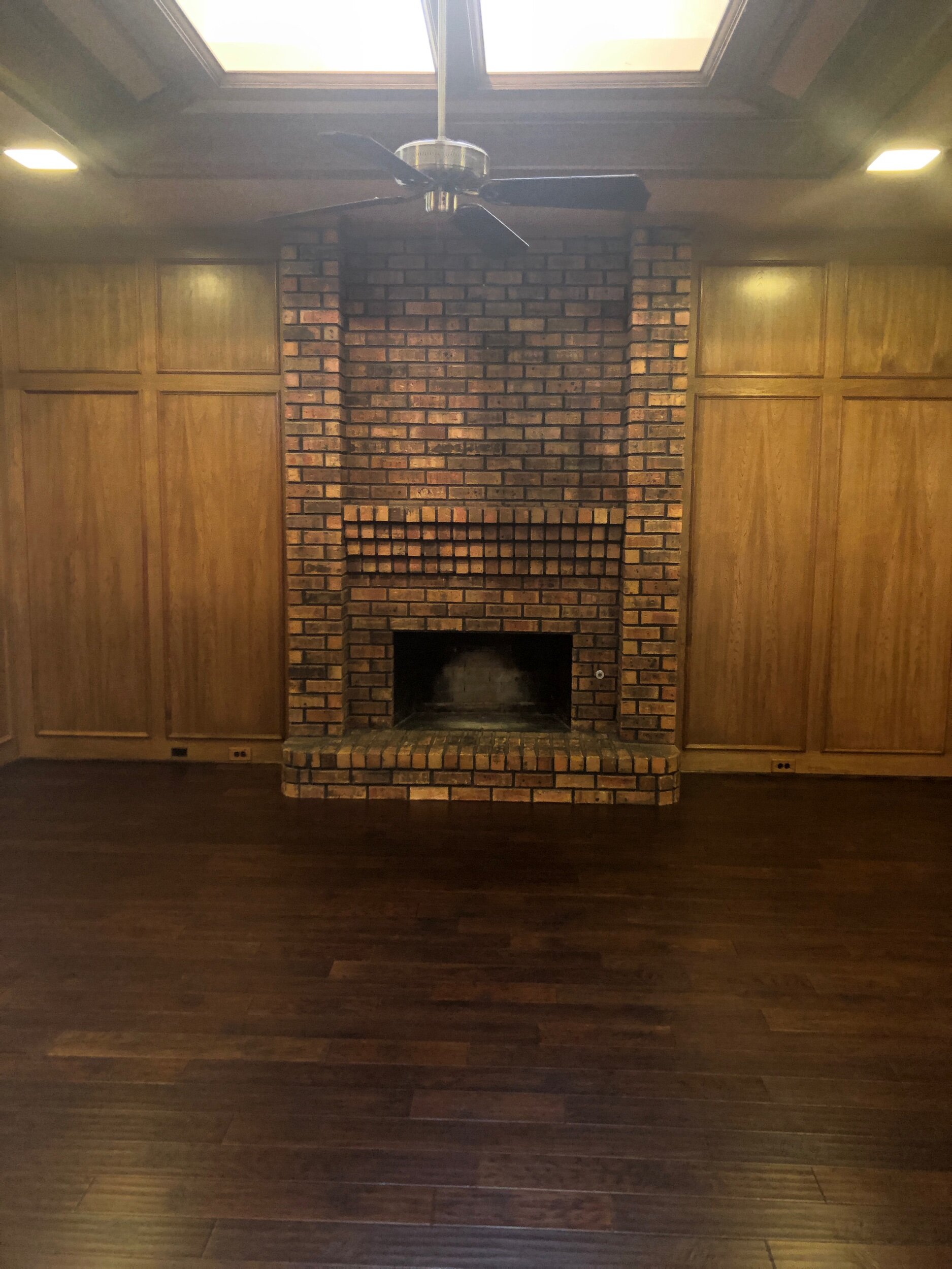 Before
“Den” is the perfect word to describe this room. Dark and cavernous, but almost unintentionally. Heavy materials were used without much thought as to the affect it would have on the room overall. I knew I wanted to remove the ceiling fan (sure it’s a new day for these babies, but I really prefer to only have them in bedrooms if at all possible), change the flooring (we were changing these throughout the house), and punch the style of the space up to the next level.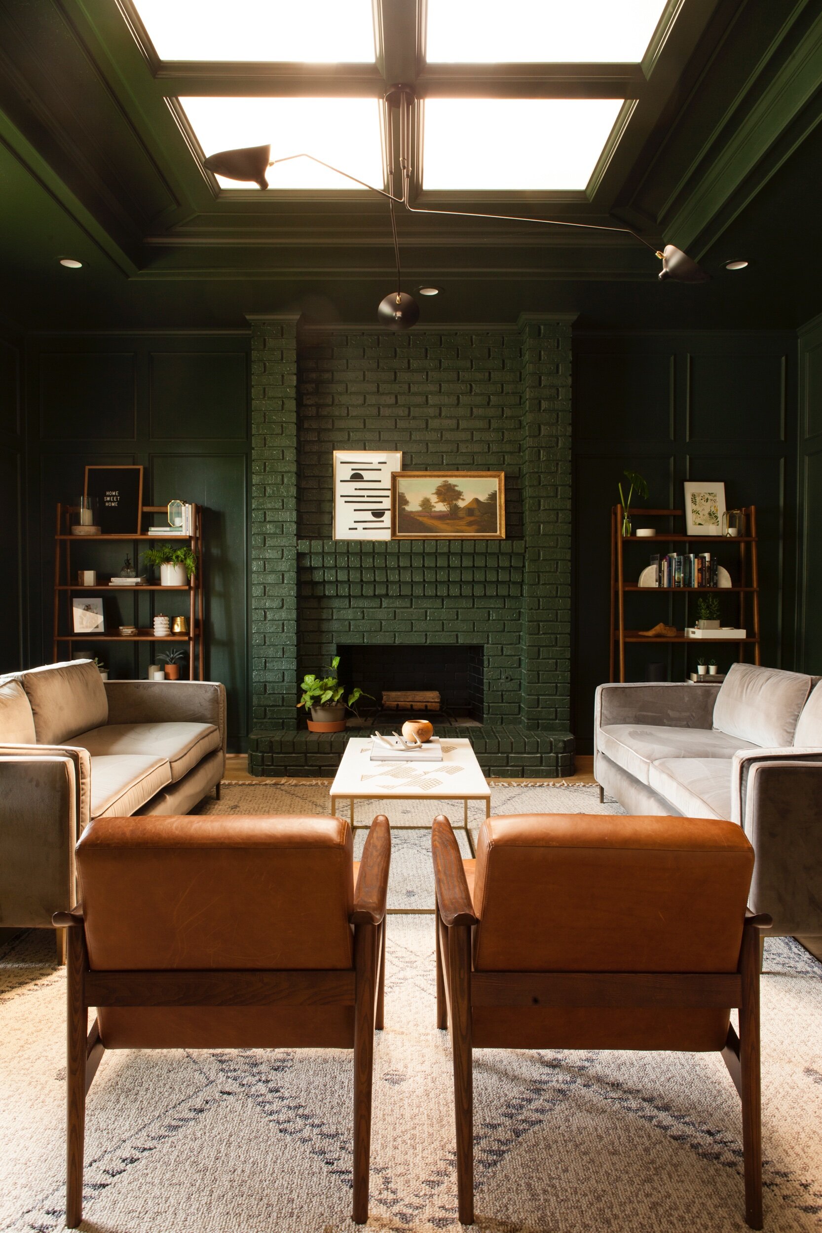
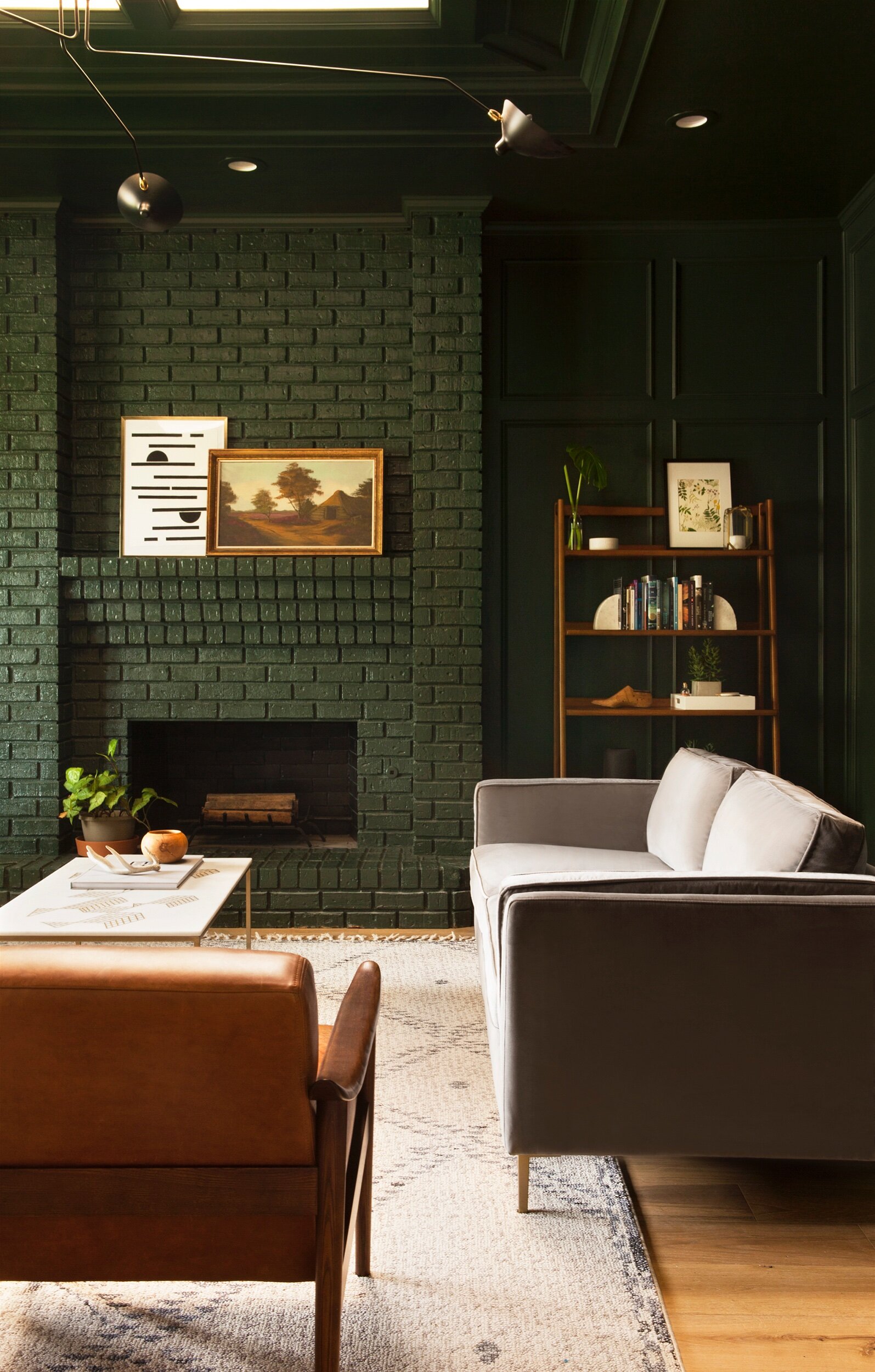
Dramatic improvement, is it not?? And you can easily tell who the MVP of this change is: PAINT. Aside from the flooring and lighting changes (which absolutely add to the design), simply painting the walls, fireplace, and ceiling is what transformed this room. After sampling several options, we went with Alpine Trail by Behr in a semigloss finish. I love how the sheen reflects the light from the front window and skylight, as well as how it highlights the beautiful millwork (which was being missed when the room was all brown).
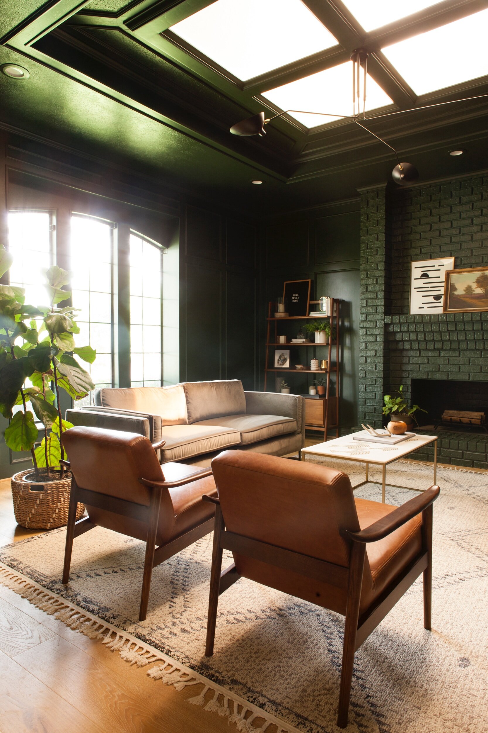
We swapped out the ceiling fan for this iconic three arm stunner, which really helped kick off the style of the house (my clients love midcentury design). The homeowners already had these beautiful bookshelves and vintage arm chairs, which gave me the direction I needed when it came to furnishing the rest of the room. The rug is another one of my favorite parts of the room – Moroccan inspired, but not the same over-replicated one you see in everyone else’s house, you know?
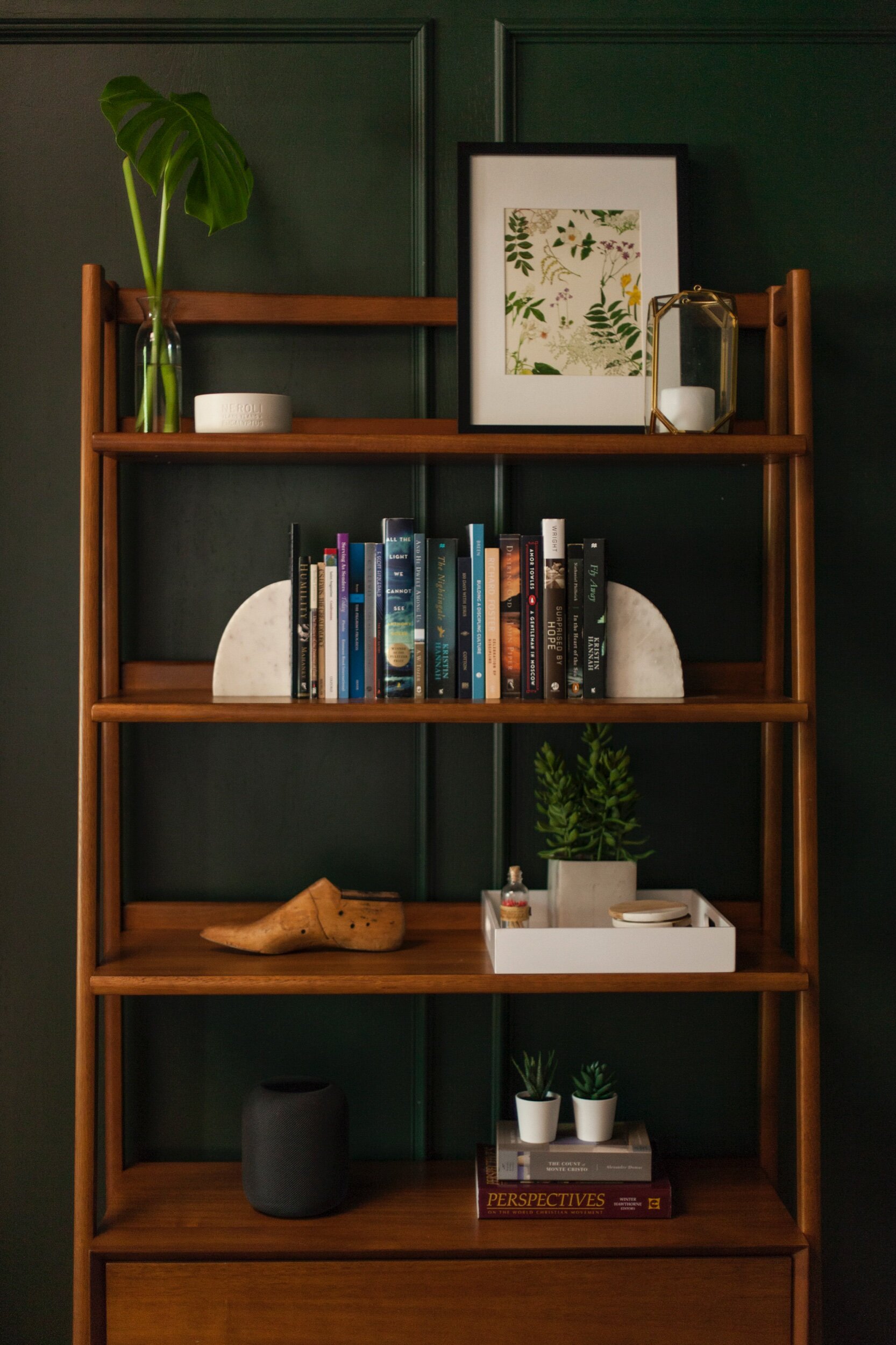 This room serves as part library, part bar, part lounge, part church small group meeting place (the perfect multi-use space). I wanted the materials to be durable, but also luxurious. Enter this performance upholstery; while technically a polyester-cotton blend, it feels almost exactly like velvet, and makes you want to swan dive headfirst into it and never come back up. I think it’s the perfect accompaniment to the leather chairs.
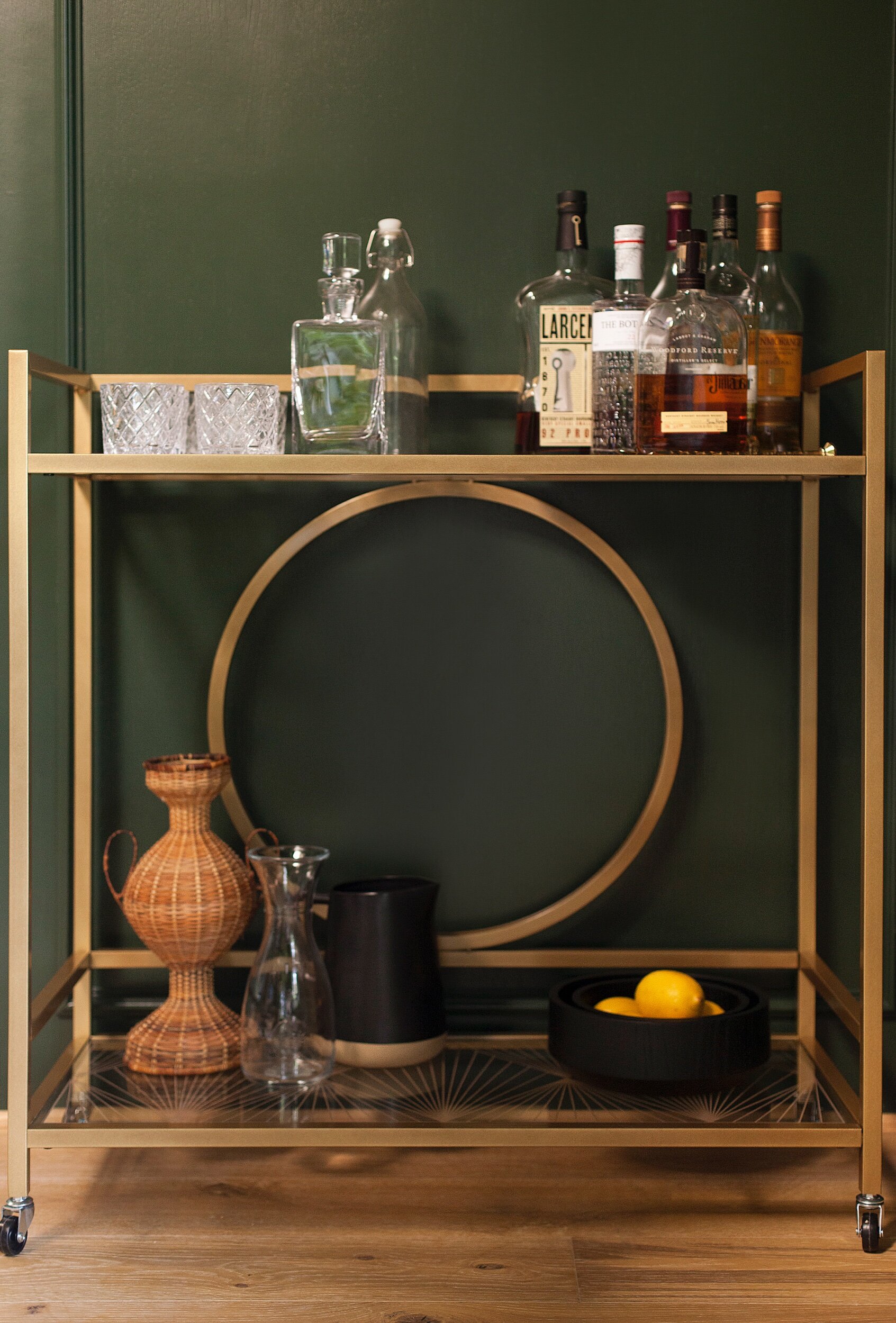 We finished off the design by bringing in some brass to add warmth and reflection. The coffee table’s marble top also adds a dash of light to the room.
Photography: Matti Gresham
Flooring: Vanier Solis European Oak
Paint: Alpine Trail by Behr
Sources:
Leather Chairs (vintage, but these are similar)
Oil Painting (vintage, but this is similar)
xo,
sarah
read or leave a comment